Revamp Restyle Reveal: The Big Living Room Reveal!!!
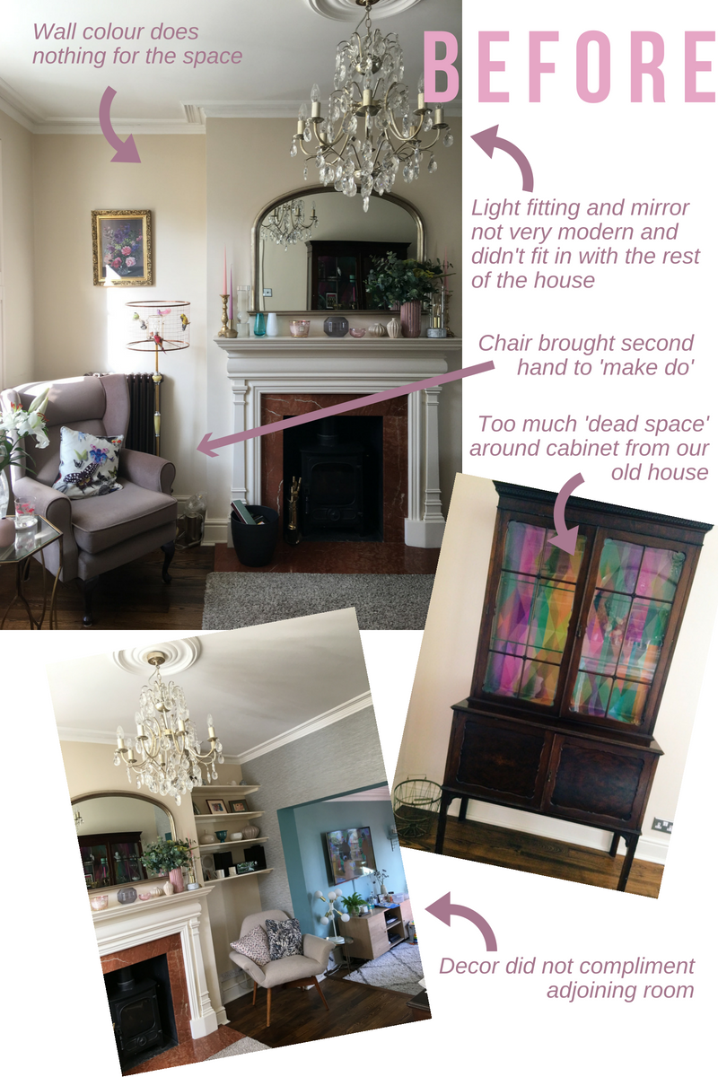
I am so excited to reveal today a HUGE project that I have been working on for the past 4 weeks - my living room transformation! I was delighted to be asked to take part in Revamp Restyle Reveal again for the second year, where 10 UK interior bloggers undertake the 4 week challenge of re-doing a room in their home with the help of some fantastic brand sponsors. The challenge of course is not an easy one - Revamp Reveal Reveal has a very DIY ethos, so hiring in tradesmen to do the hard work is not an option! This year I chose to revamp my living room. I have never decorated this room as I have really struggled with just how it should look. It was still painted in the same colour chosen by the previous owners (magnolia, which I hated) and it was filled with furniture from our old house that was never purchased for this space:
As you can see the wall colour was quite bland and the walls just felt 'boring'. I had added in some wallpaper on the arch wall which I loved, but felt wallpaper on all walls would be a bit overkill. The furniture mostly came from our old house and the key piece - the armchair by the window - was bought second hand when we moved in just because we needed an extra chair. I never really liked the colour and against the magnolia everything appeared so washed out. The light fitting and mirror felt dated and didn't match the more contemporary style that I had decorated the adjoining TV snug room in. An old display cabinet was placed by the back wall, but there was dead space all around it and the room desperately required more storage.
This room is probably the best room in the house with the log burner and large window, but it was just not living up to its potential. Instead, I wanted to create a grown-up, boutique hotel lounge space - somewhere I could relax, read and listen to music in front of the fire. The room needed to complement the adjoining space, and I needed to make everything more visually appealing. Storage was an issue so this needed to be addressed inexpensively.
So, if you haven't scrolled down already....here is the BIG REVEAL!
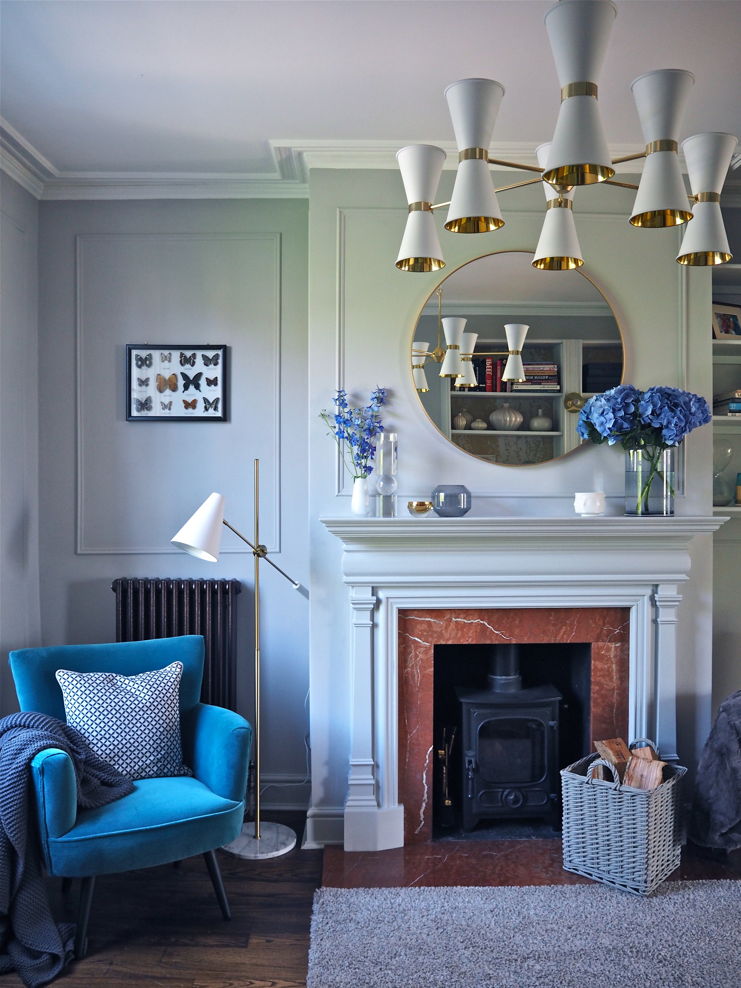
The first big DIY project that I undertook was to add panelling on all walls. I was only going to do it above the fireplace and in the alcove where there were no shelves, but once I started and saw just how good it looked I ended up putting it everywhere! I cut decorative moulding to size using a saw and a mitre box and glued it to the wall. I then painted the walls, fireplace and the skirting in 'Cats Cradle' Claypaint by Earthborn Paints, which is a very clean, very matt soft grey.
The grey compliments the blue of the adjoining room, while working perfectly with the blue and gold accents that I wanted to add in via the furniture and accessories.
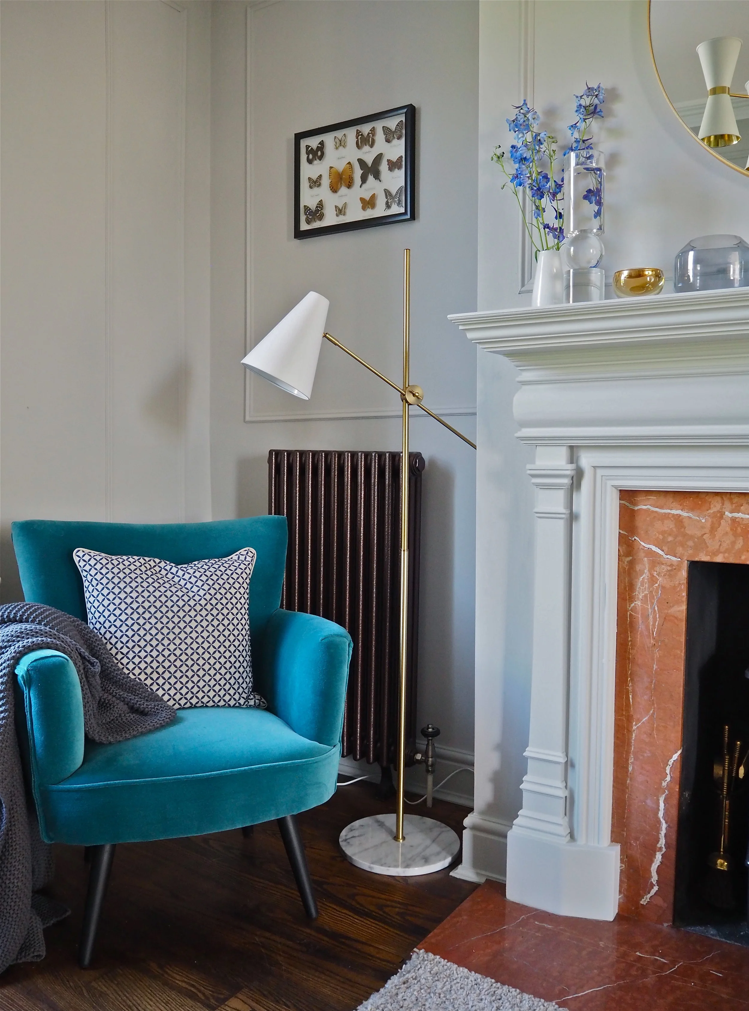
I swapped out the old second-hand armchair in the washed-out fabric for this snazzy new blue velvet number from RRR sponsor Maisons Du Monde. This is the Sao Paulo armchair in the blue colourway. I love the shape of this cocktail chair: the colour draws your eye as soon as you enter the room. I also replaced the DIY birdcage light with this modern white, gold and marble floor lamp, also from Maisons Du Monde, which works perfectly alongside the blue armchair.
I have added LOADS of storage to this room. I replaced the ineffective display cabinet with a DIY bookcase that is actually two cheap flat-pack bookcases hacked to look a lot more bespoke. I used the basic bookcase structures, then built on and around them with decorative moulding and MDF tongue & groove. I added in lighting between the bookcases and primed them with Earthborn Paints Multi-Purpose Primer, then gave them a few coats of eggshell in the same colour as the walls so the bookcase 'washed in' to the room and didn't overly feel imposing, even though it is so large. The best thing I did to this bookcase was to line the back of the shelves with some beautiful Harlequin wallpaper from Style Library. This wallpaper - 'Eglomise' in a metallic gold colourway - adds another dimension to the room. It creates a lot more visual interest than if I just left the whole shelf unit one colour. The gold in the paper is reminiscent of gold leaf and it has a very delicate 'antique-like' effect.
For unsightly items to be stored on this bookcase, I chose some navy storage boxes with leather handles from Sainsbury’s Home to keep safe items and trinkets. I'm going to be doing a dedicated blog post on this bookcase hack and the styling of it in a couple of weeks so if you are interested in just how I did it, stay tuned for that one!
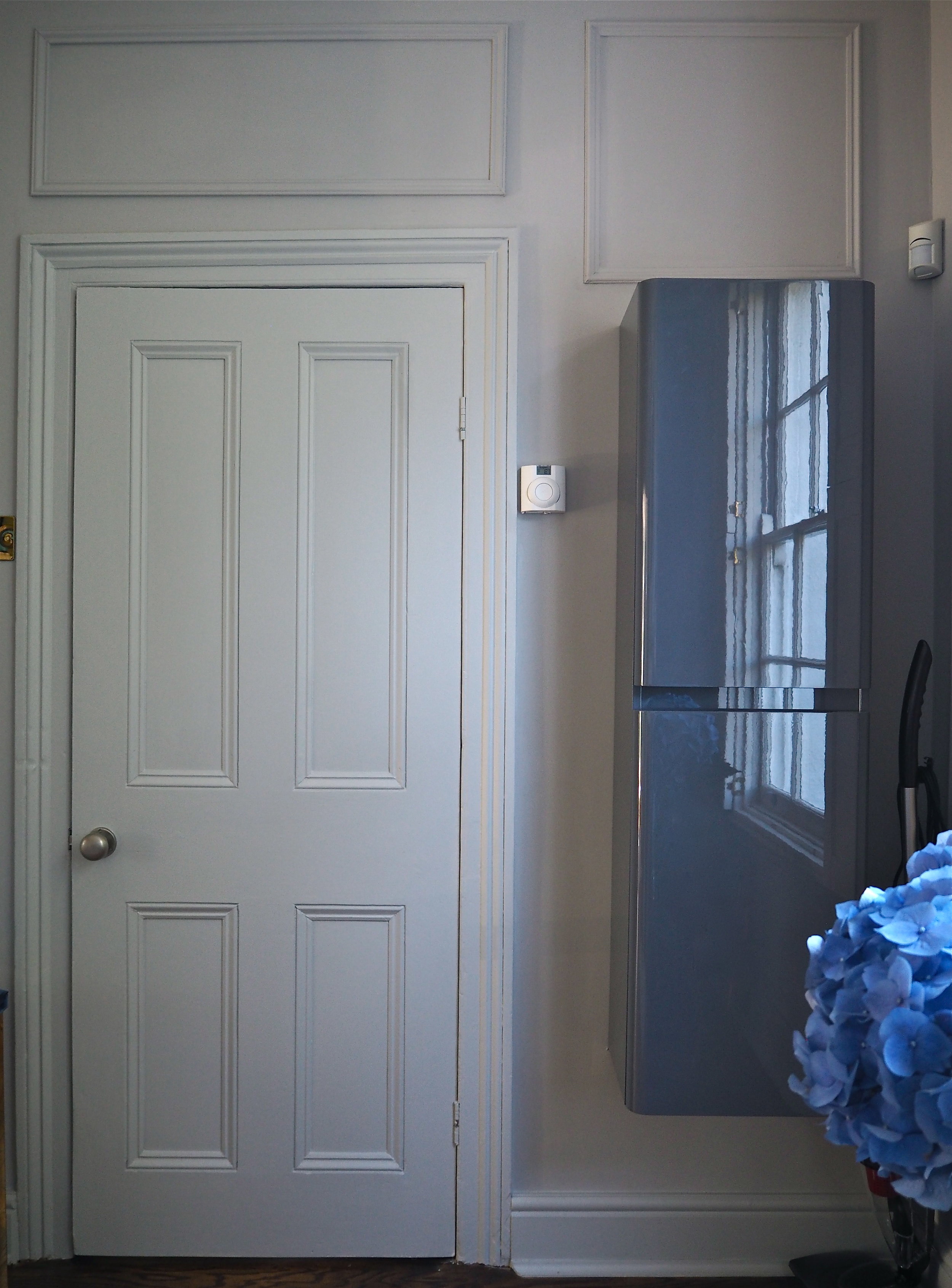
The second piece of storage I added was this slimline wall-mounted cabinet from sponsor Soak.com. Again, this area behind the door was another dead space area. I had looked into slim-line bookcases for it before, but due to the placement of the thermostat and alarm monitor the standard 60cm bookcases had been too wide. This cabinet from Soak.com (generally intended to be a bathroom cabinet) has a perfect 40cm width, and now there is a dedicated space to store general everyday items that used to be just left around the room such as letters, packets of wet wipes and take-away menus!
I cannot even begin to tell you how happy I am with the David Hunt Lighting Hyde 12 Light Pendant that has gone up in this room. As soon as this went up everything in the room just pulled together to give me that boutique hotel look I was after. Made from real brass, the light just oozes luxury. I also love how it is reflected in the new, more contemporary circular mirror over the fireplace:
I also got a very cool smoked gold bubble lamp from sponsor The Cotswold Company that I've styled on my new bookcase - perfect for evening atmospheric lighting.
As well as the new lighting and furniture I chose some simply stunning accessories from some of the very generous sponsors for Revamp Restyle Reveal. Christy Home supplied me with two of these very gorgeous Penzance Ink cushions. I put one on each chair on either side of the fireplace so even though the chairs are different, they are more cohesive featuring the same cushion. I also got this very soft yet chunky Oslo Charcoal Throw which drapes perfectly on the edge of armchairs, adding some much-required layering to the room.
To really style up the fireplace and highlight the fact that I am lucky enough to have a log burner, I swapped out the old plant pot that used to contain the fire logs in place of this soft grey log basket from Sainsbury’s Home! Then to really 'up' the cosiness factor I chose a grey faux-fur throw from sponsor The Cotswold Company.
So what do you think of my new room? I absolutely love it and am really proud of what I have achieved. Of course, it would not have been possible without all the beautiful products supplied by the wonderful sponsors, and all the hard work carried out by hosts Bianca Hall & Lisa Dawson! So thank you to everyone who made this happen. Now hop on over to the other 9 bloggers’ rooms and check out all their before and afters!
