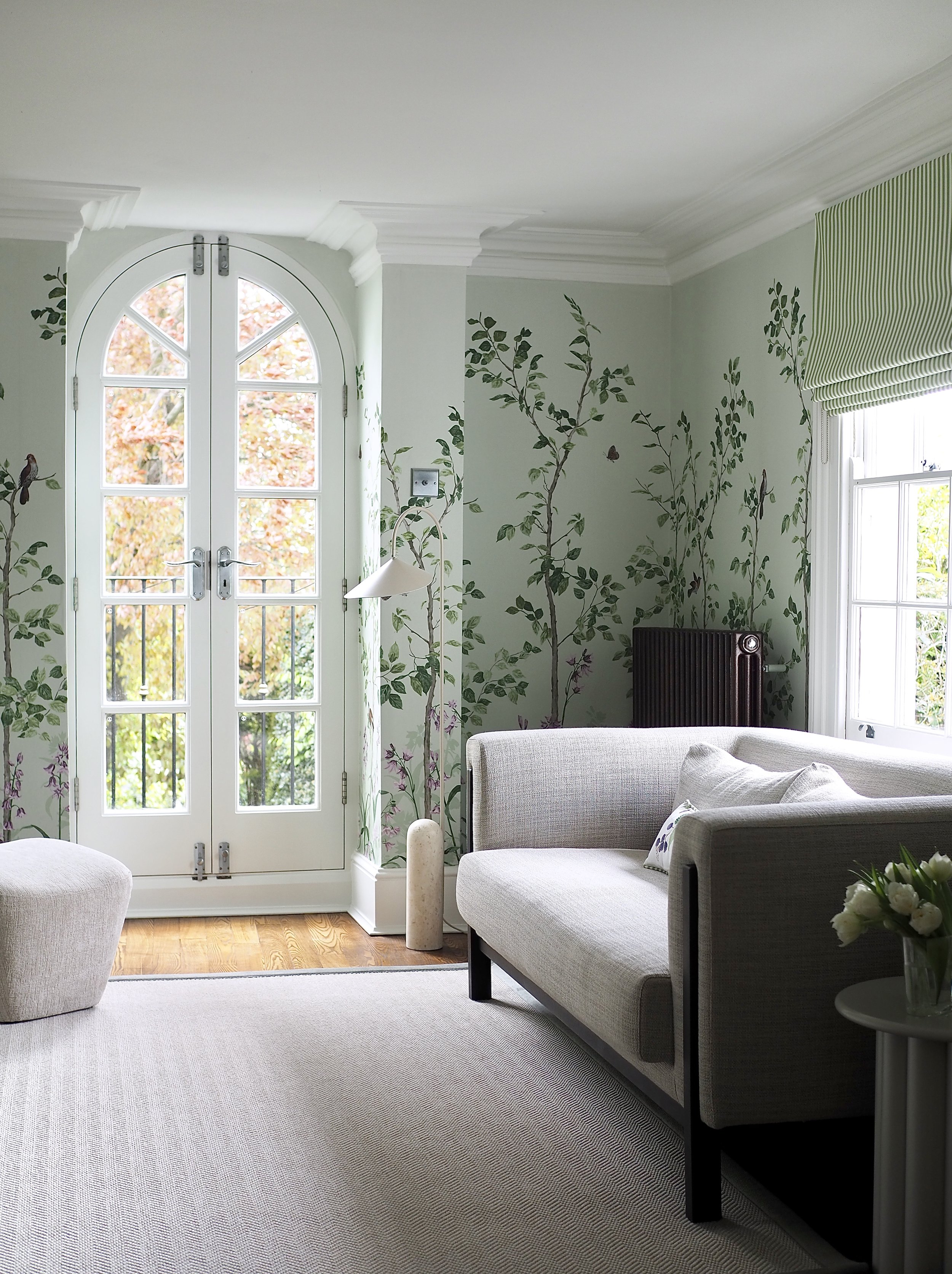
How I transformed my tired living room with a botanical green wall mural and stylish neutral furniture and soft furnishings.
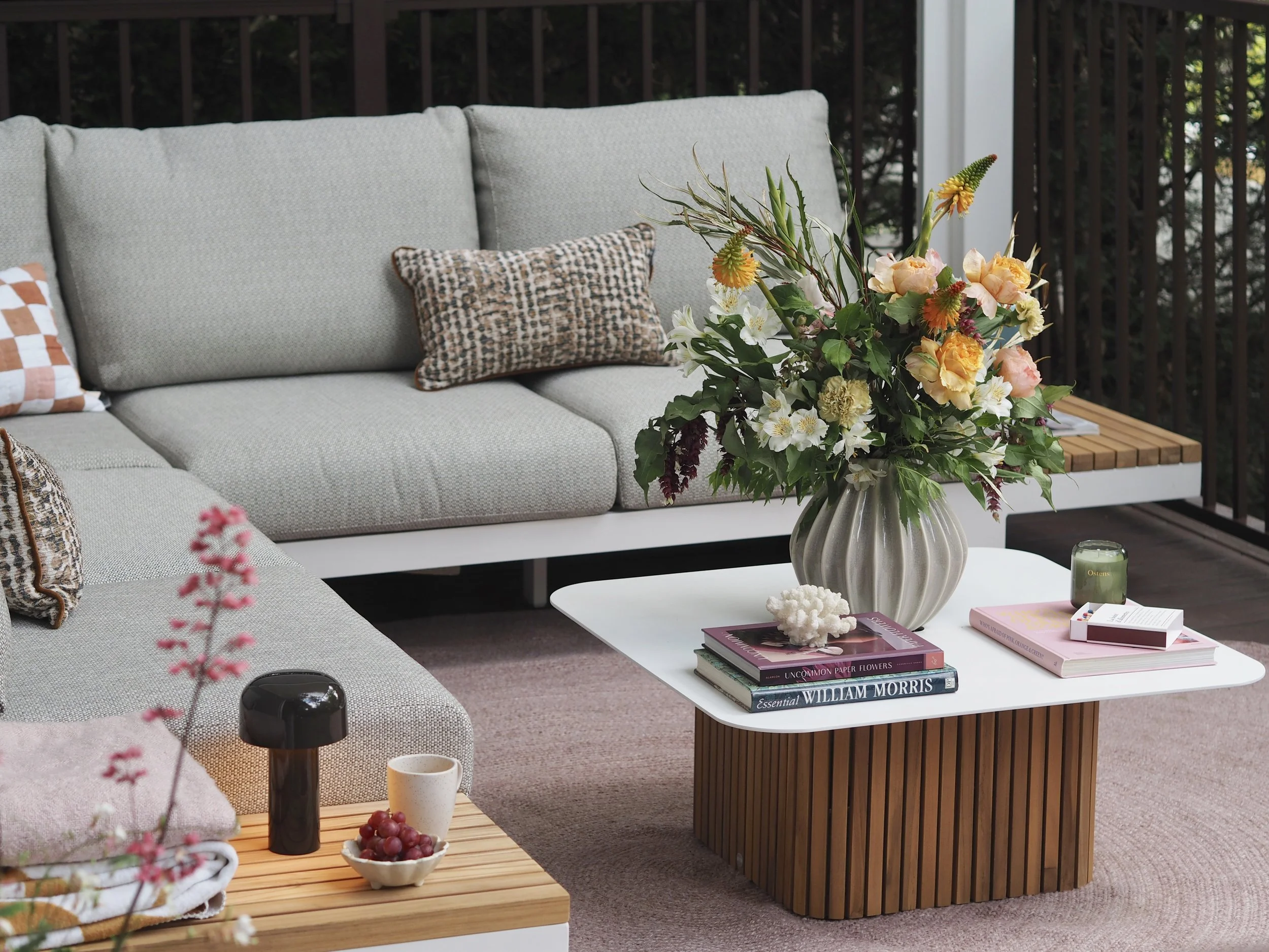
Sponsored Content: How I created the perfect outdoor living space and transformed my garden! Read my tips here…
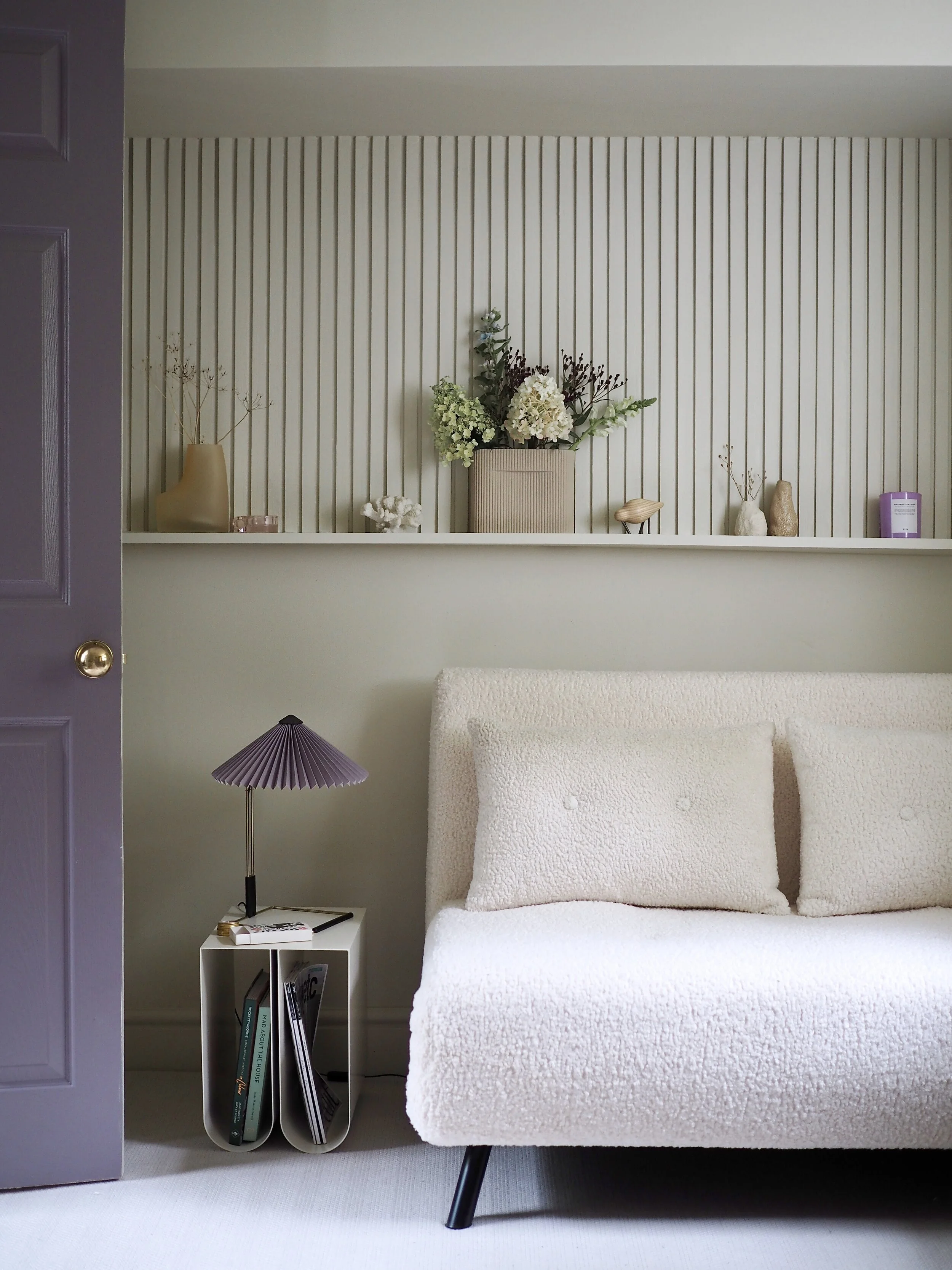
How I turned a basement room full of crumbling plaster into a warm, neutral workspace and guest bedroom…
Sponsored content: Check out this amazing before and after hack of my TV unit with Cover Styl’ architectural smart film solution!
[This post is sponsored by Flymo] The courtyard garden makeover reveal! Read all about how I turned my outdoor dumping ground into a romantic al fresco dining area in just 3 weeks!
It has been a long time coming, but finally, I am delighted to reveal my lockdown bedroom makeover, decorated during the 2020 pandemic…
As I helped my son put on his uniform for his very first day at school, I scanned his bedroom and quickly realised that he had drastically outgrown the room I had decorated for him when he was just a year old. No longer a baby, his nursery-like bus wallpaper and aeroplane-themed furniture handles did not reflect this strong-willed young boy in front of me. His room needed to be updated, so over the space of 6 months I worked on different areas of the room to make it more in-line with his age.
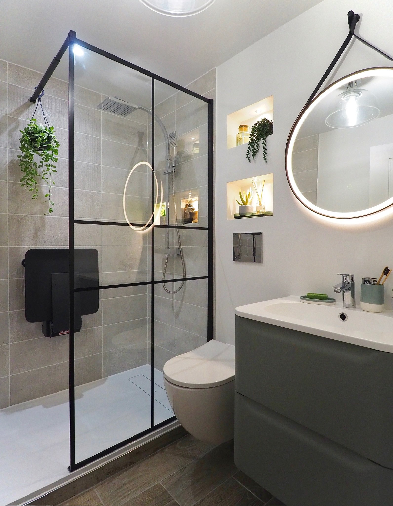
When we moved into this house four years ago we inherited what I called ‘The Most Boring Bathroom In The World’. This en-suite was off a room in the basement that we use as my office / guest bedroom. It was adorned in the most basic, large white tiles and had an ivory window. I tried to add a large picture and a few accessories in here but it didn’t really make much of a difference to how good it looked! The ceiling constantly peeled even though the shower was only used about twice a month and when all the tiles started to crack it started looking even worse!
This hallway reveal is really a tale of two designs. The upstairs landing is pretty, pink and floral as planned (you can read more about that and see all the ‘before’ pictures here). While the the lower floors are more contemporary and the colour choices were only decided on halfway through the decorating process. For this project I decided that the skirting, doors, windows and coving would be made key features using colour, while the walls would simply be the backdrop. This is in reverse to how the hallway looked before, which was the traditional ‘colour on the walls + white woodwork’ look. The main aim of this makeover was to add some much needed interest to the space and while I had considered adding mouldings and panelling, I felt it would be too imposing on the narrow area. The period doors and and original coving were great features, so it was these that were to ‘sing’.
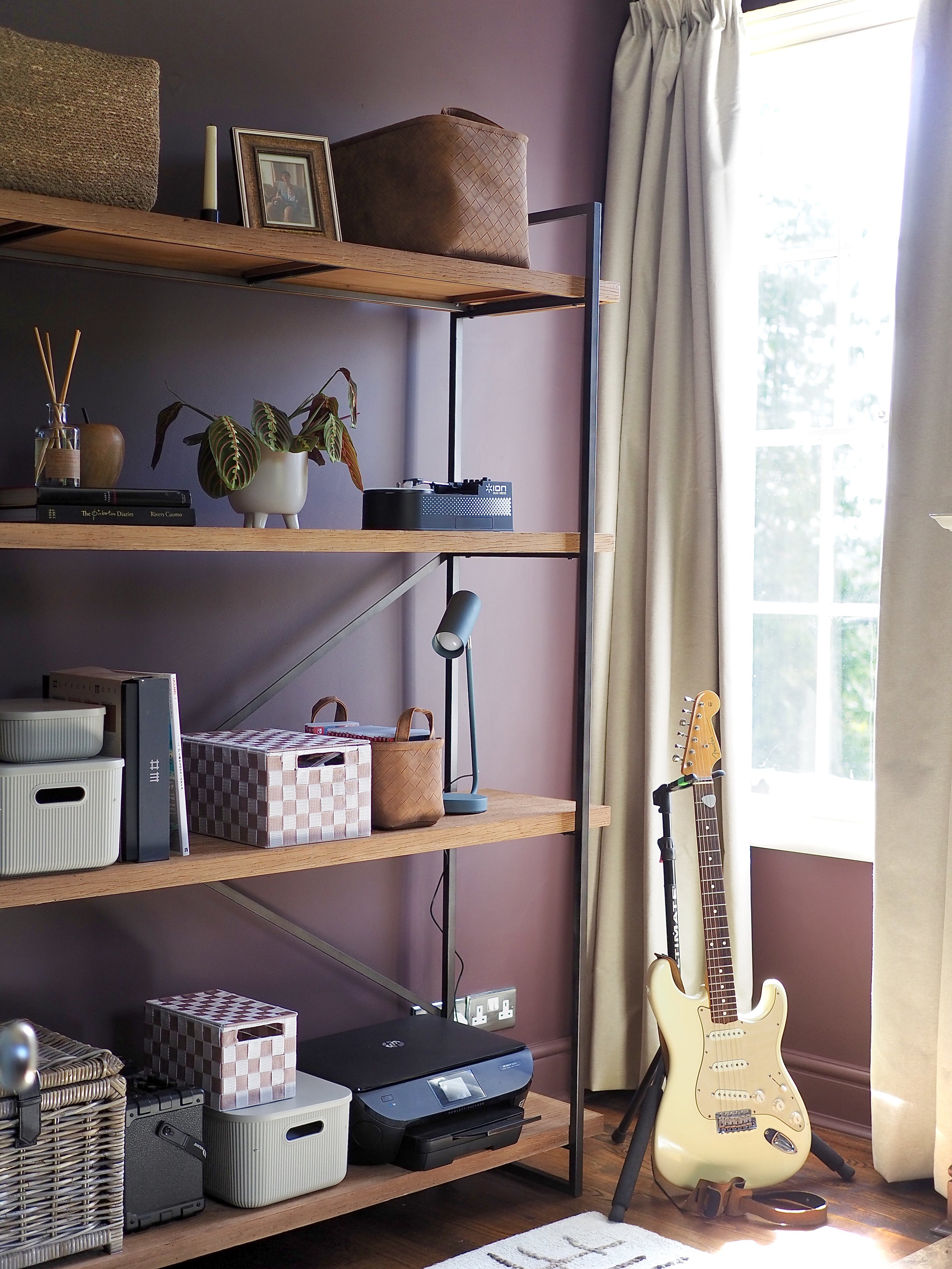
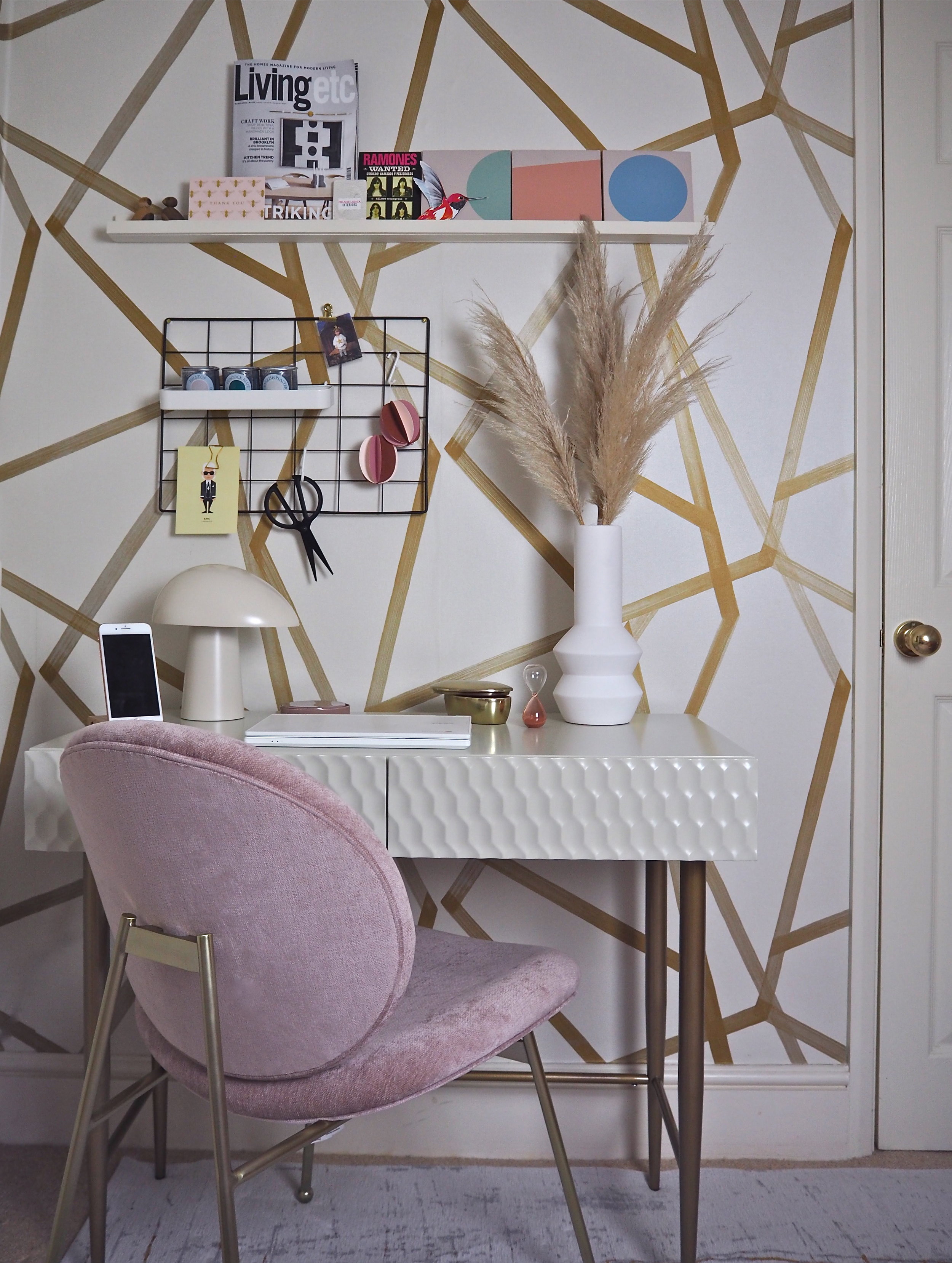
I’m delighted to reveal my mini home office makever today on the blog! On my previous post, I talked about how the shared home office I had with my husband wasn’t panning out, while at the same time, the ‘guest room’ in the basement was hardly being used and had turned into a dumping ground. With the help of some amazing and generous companies, especially West Elm, I have now turned this space into my own home office and I LOVE IT!!
So it might seem like it’s all talk and no action round these parts - my last post was on a home office and en-suite makeover yet to be revealed - but sometimes projects and opportunities just overlap! Today, I want to talk about my plans for a makeover to my hallway, which has never had much attention and has therefore never really worked. As I have decorated around the house, the hallway has become more of an issue as this is the space that flows between each of these new rooms. Each room feels unrelated and disconnected from the hall, when really it should be an introduction to each separate space.
Two years ago I did a ‘before and after’ blog post on creating a home office that both my husband and myself were going to share. As a musician, he was often away travelling and I had only just started this blog, so just blogged as and when for fun. Fast forward two years, he is working from home most of the year and I am running a design consultation business alongside this blog. The shared space was just not working for us anymore. He filled the room with musical paraphernalia and it became a shotgun game to who got to use the desk. I started to think we might be outgrowing the house, when it occurred to me that we had the space, we just were not using it efficiently.
Room reveal posts are my favourite type of blog posts. I always love reading the before & after posts of other interior bloggers, while simultaneously they are my favourite posts to feature on my own blog. I’ve not had a room makeover post on the blog since the summer, so I’m delighted today to reveal my dining room transformation with iconic paint, fabric and wallpaper brand Sanderson.
It has been a few months since I’ve had a total room revamp in the house, so I’m delighted today to talk you through my plans for redecorating the dining room! The dining room, which is joined onto the kitchen, has needed some love for a while. The walls are stained, the skirting chipped and the ceiling has all these wipe marks on it after an incident with my young son and a glass of apple juice. When B&Q came to do some filming in my house a couple of months back, they wanted to paint a room in a vivid colour so I told them to use the dining room. The dining room then became a lovely blue shade, but as the room is in the basement of the house the colour was just too dark for the space (and yes I know I say to embrace dark rooms with dark colours but we use this room as a ‘doing’ room, I did not want to create a relaxing feel in here.) They also did not paint the ceiling or skirting for the filming, so this room was marked down as next in line for a complete decorating overhaul.
I am so excited to reveal today a HUGE project that I have been working on for the past 4 weeks - my living room transformation!
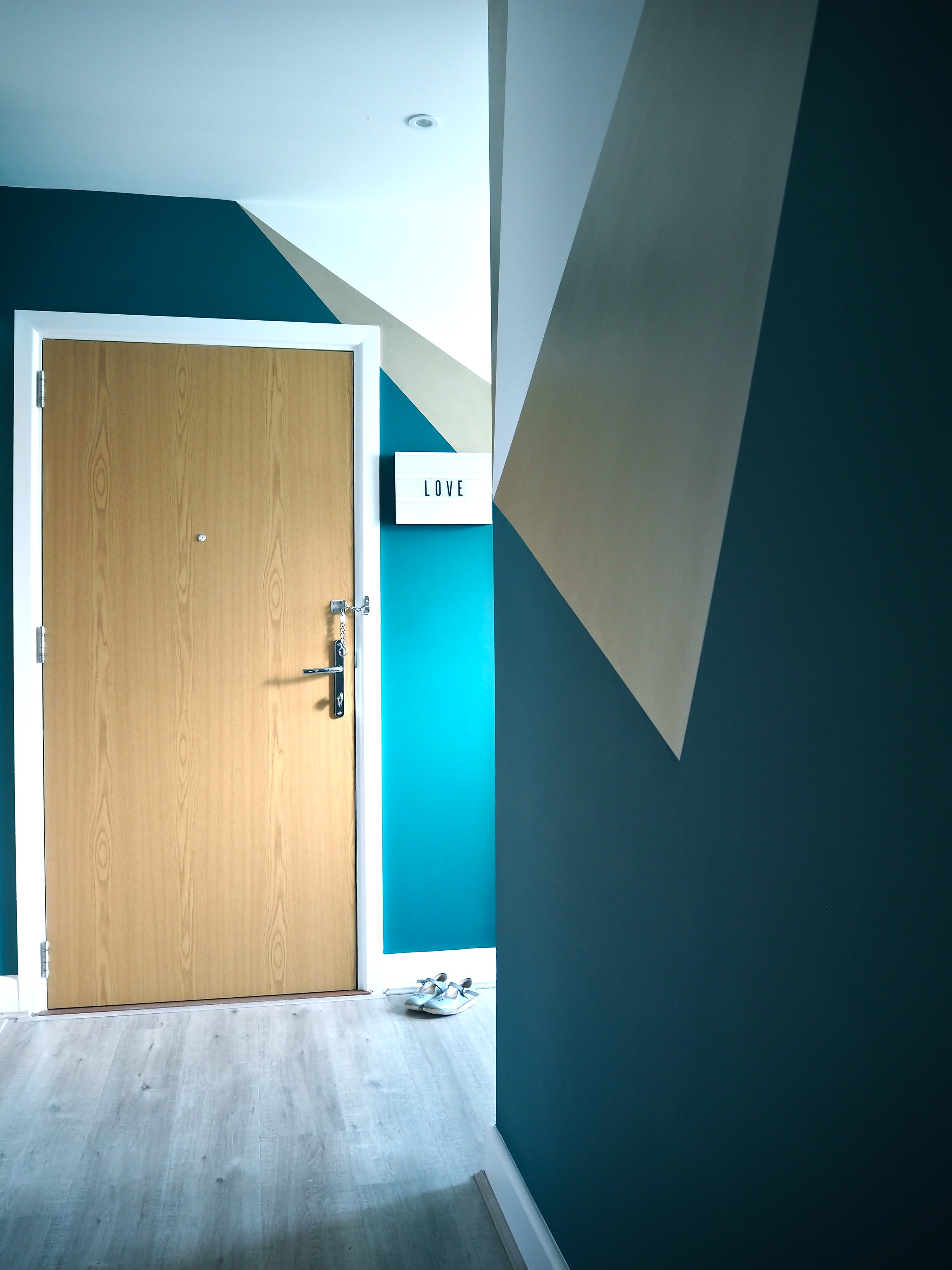
A big mistake that people make with hallways is they think they have to keep them plain and neutral in colour. The fear is that an often narrow space will feel even narrower and enclosed if it is painted anything other than white. The truth is having a hallway in a deep colour will actually make the rooms coming off the hall feel much larger and brighter as you walk into them.
According to the interior mags and those 'in-the-know', minimalism is out for 2018 and maximalism - vibrant colours, patterns and a 'more is more' approach - is in. Being much more on the maximalism side than minimalist, I was pleased to hear this as I have just finished decorating my bedroom in Farrow & Ball's new Hegemone wallpaper, and giving my bed a fresh new update in beautiful, luxurious Yves Delorme bed linen.
Long time readers of this blog will know that I've been working on my guest room for a loooooonng time. The room is in the basement of the house below ground level, is small and is therefore really dark. When we moved in I painted the room, but the room still just felt cold and had no homely, cosy feel to it at all. Being the guest room it also became victim to having furniture put in it from our old house that had no place elsewhere in our new home. Here is what it looked like before:





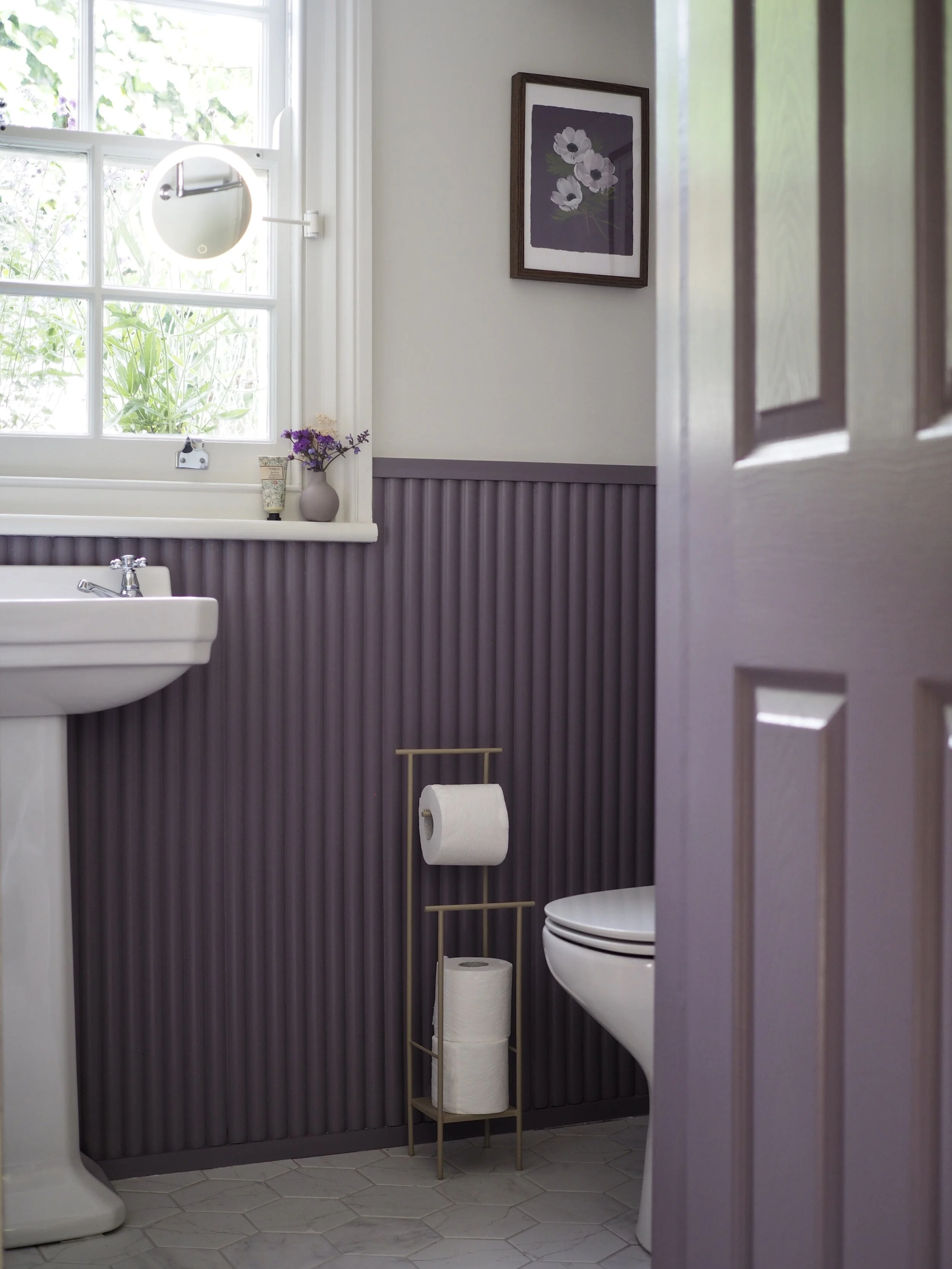







Painting my little loo in Nether Red by Little Greene…