Exploring Brutalism In Interior Decor: The Good, The Bad & The Ugly
Brusa Cabinet via Sweetpea & Willow.
Brutalism is having a moment. Once considered cold, stark and unwelcoming, this interior design style is now widely being embraced by homeowners seeking a bold, minimalistic look.
Characterised by the heavy use of raw materials, exposed concrete and an industrial vibe, brutalism might seem like an “out there” choice for a home. However, for some, the minimal lines and straightforward nature of its design have made it a welcome change from years of over-the-top decorative interiors.
If you're someone who wants to know how brutalism can fit into your decor plans, in this post we will explore the good, the bad and the downright ugly aspects of this controversial interior design trend.
Image credit: Cult Furniture.
Brutalism: The Good
Brutalism at its best can be the perfect embodiment of minimalist-chic interior decorating. The beauty of brutalist design lies in its ability to strip away the unnecessary fluff and focus on the raw, unadorned materials. Think gorgeous exposed concrete walls, natural stone floors and simple, no-nonsense furniture.
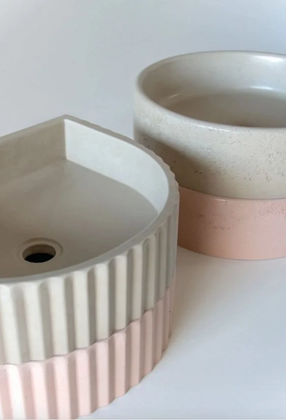
A great example of brutalism and how it has been embedded within modern interiors are the concrete sinks which have soared in popularity over the years. Concrete may seem like a cold and industrial material at first glance, but when used thoughtfully, it creates a statement piece that’s both appealing to the eye and super practical. A concrete sink can add a central feature point to your bathroom or kitchen with its rough (and surprisingly warm) texture juxtaposing against other modern and sleek interiors. Plus, it is actually incredibly versatile and works equally well in super sleek bathrooms as it does in industrial kitchens. It is here, in this mix of form and function, that we find the brilliance of brutalism: elevating the everyday object into something that feels intentional, sturdy, and long-lasting.
Image Credit: Sticks and Stone Co
A brutalist aesthetic also transcends time and trends, ensuring that it never goes out of style. If executed properly, brutalist design serves a solid base, allowing you to soften the space with furnishings like plush area rugs, indoor plants and warm lighting to create a balanced and livable space.
Brutalism: The Bad
The most common argument against using brutalism in interior design is that it can quickly make a room feel cold, sterile, or even unwelcoming when not done carefully. Those exposed concrete walls and stone surfaces that look amazing in home design magazines can quickly make a space feel more like a bunker than an inviting home if there aren’t enough contrasting elements to warm it up.
The problem with brutalism is that it tends to take the cosy/comfort factor out of a room, leaving you with something that feels too sparse or unfinished. The hard, gritty feel of concrete and steel can easily make a space look stark or severely lacking in “soul” if not properly broken up with the right blend of materials and textures to soften things up. While this may appeal to some, others might find it difficult to relax in a room that feels so utilitarian.
Ferm Living Burl Coffee Table via Nest.co.uk
Another downside to brutalist interiors is its echo and poor acoustics. The hard surfaces (such as concrete walls and floors, characteristic of the brutalist style) make it so that the sound does not get absorbed but rebounds instead. As a result, the space might end up feeling quite noisy and cavernous, none of which would be a great fit for a living room. To mitigate this, you will need to add softer elements here and there – rugs, curtains, cushions – in order to balance out the acoustics.
If you’re drawn to brutalism but worried about its coldness, a great workaround is to mix materials. Some warm wood tones, a few soft fabrics, and some natural light will do wonders to transform your space. This way, you get the best of both worlds — the chic boldness of brutalism without sacrificing comfort and all those cosy feels.
Brutalism: The Ugly
Just like with any other style, brutalism can sometimes take a turn for the worse. This interior design trend risks feeling oppressive, monotonous, or even just plain ugly.
The same materials that can give a space a modern and sleek look can also make it look unfinished and cold (there is a thin line between a cool industrial vibe and a space that looks just plain depressing). While well-placed concrete can add texture and depth to any room, four concrete walls can make a living room feel more like a parking lot.
Another potential pitfall is the overuse of monotone colours. Brutalist design will often rely on a neutral colour palette — grey, shades of beige or white which may feel flat and lifeless. Think about how you can bring a little bit of personalisation and cosiness into a Brutalist space with small touches. The addition of artwork, mementoes and decor can make a huge difference, even if brutalism is the dominant style.
Wolcott Bookends via Sweetpea & Willow
Brutalism in Moderation
Brutalism is undeniably bold and when executed successfully, it can create a space that’s both minimalist and striking. What makes it special is its ability to take some of the simplest materials and turn them into something sophisticated, yet still functional. Balance is the key to pulling off brutalism at home. Don’t be afraid to soften the edges with warm textures, soft lighting, and personal touches that make your space feel lived-in and welcoming. Brutalism doesn’t have to be harsh — in fact, it’s the total opposite. It can be a beautiful, functional style that adds depth and character to your home when approached with care and creativity.
What are your thoughts on this controversial interior design trend? Let us know in the comments.


Five top tiling looks expected to be big for 2025…