How To Make A New Build Feel Homely And Full Of Character with L&Q
[AD - This post is a collaboration with L&Q. However, as usual, all opinions and interior advice are my own. All photographs in this post have been taken in L&Q’s Ropemakers Yard development and belong to Melanie Lissack Interiors.]
New build vs period property - it is one of the many decisions you may need to make when you consider buying a home. Older buildings, with their funny layouts, wonky walls, cracks and problem areas often have character and charm due to original features like detailed plasterwork and iron fireplaces. New builds can often appear to have a lot less character in comparison and may at first feel like an empty white box. Yet, by using lots of pattern, colour and texture, it is possible to create an inviting, warm home full of personality, as well as having all the benefits a new build offers such as energy efficiency and a great location (often being near great transport links.)
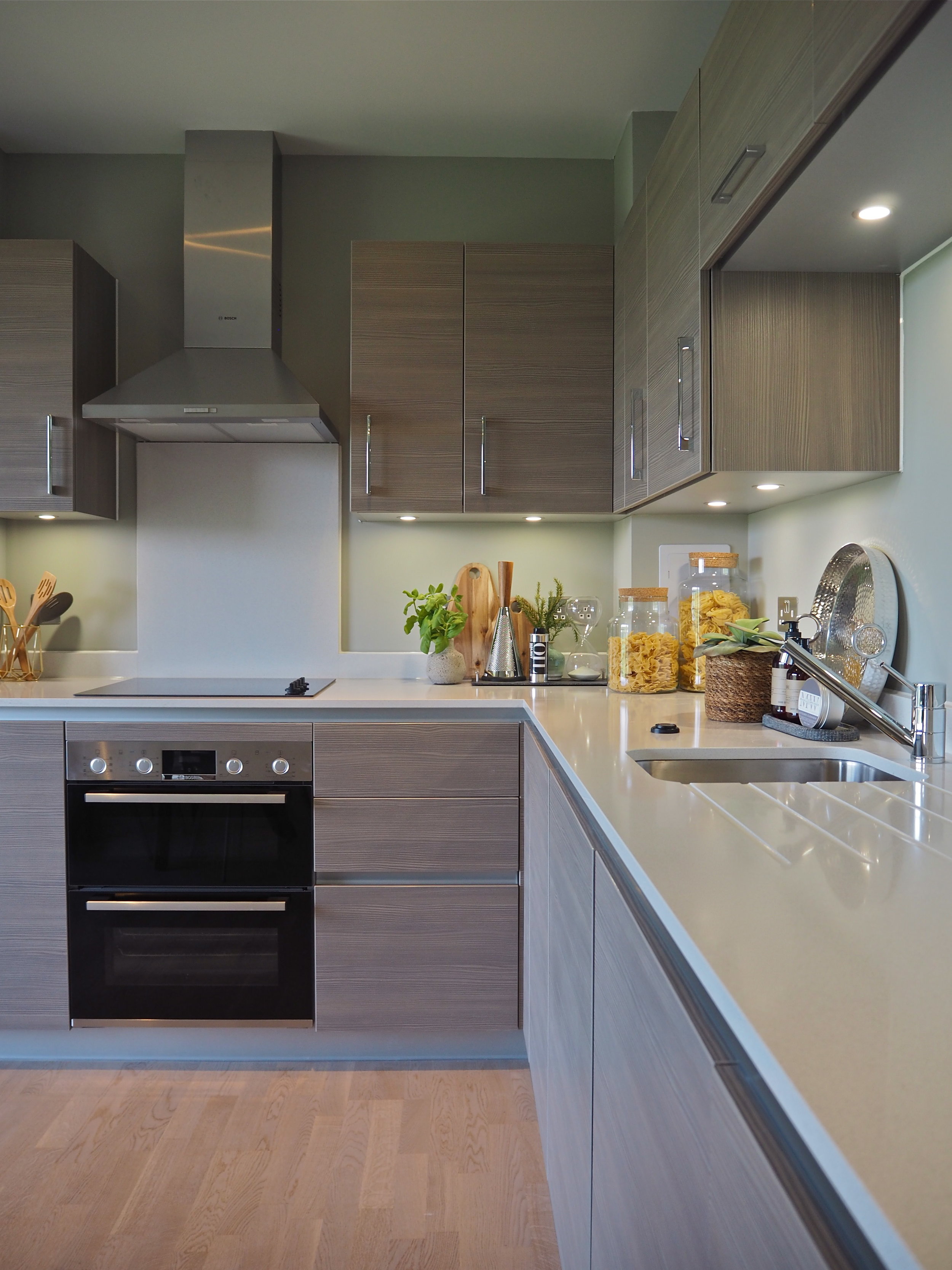
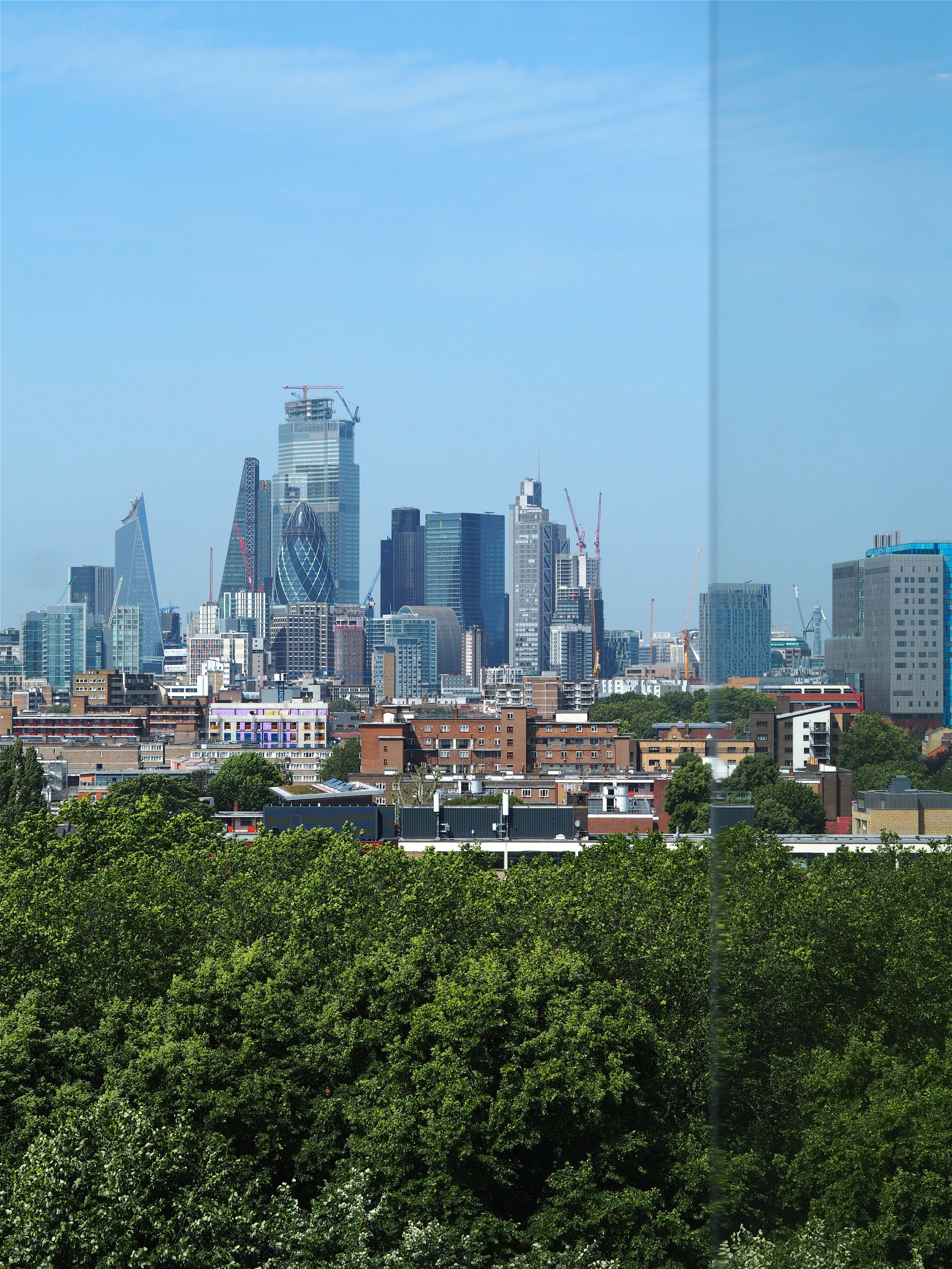
Using the great quality fixtures, fittings, and textured kitchen units that L&Q have installed as a starting point, the interior designer introduced colours from nature in the decor such as greens and blues, as well as bringing in natural materials like wood and leather. These colours tie the interior in with the vast blue skyline and the trees from the protected park outside that are so visible from the floor to ceiling windows and doors in each apartment in Ropemakers Yard. Accessories and pattern are used to draw the eye and create visual interest, while there is an abundance of layering and texture for an inviting quality. The success in transforming this new build into a welcoming home can be divided into five key interior design tricks that I’ve dissected below, in order to help you re-create this look yourself….
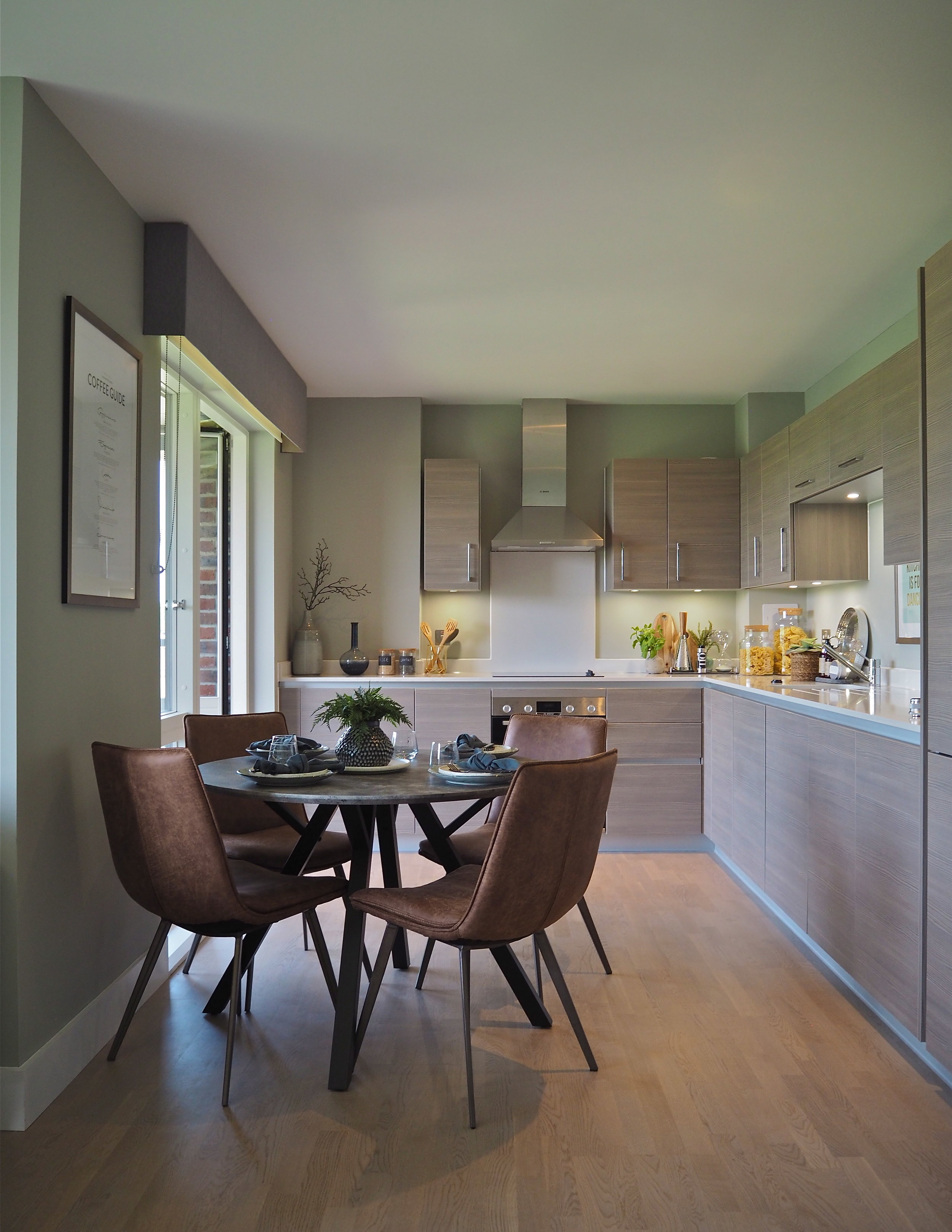
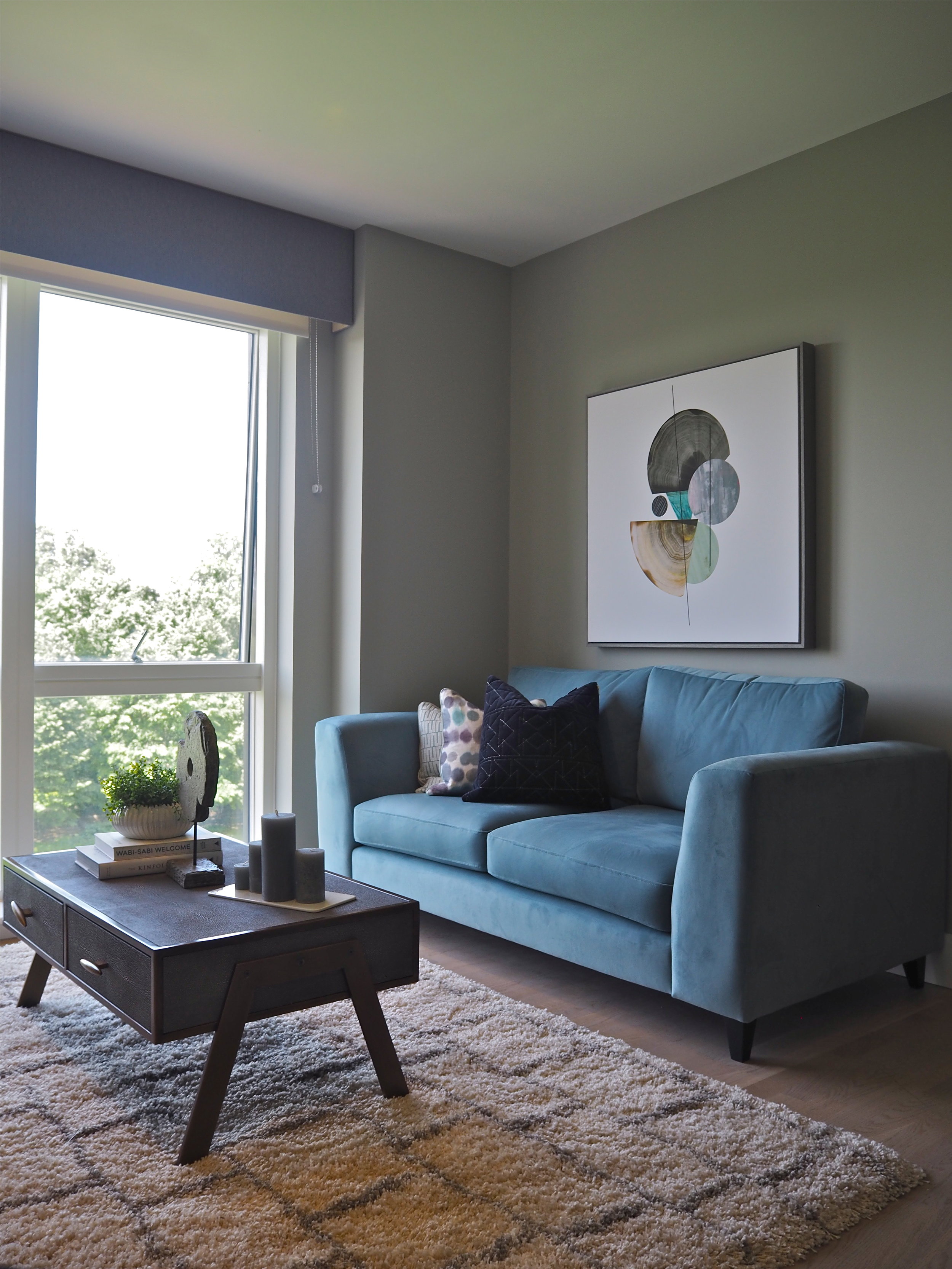
Blues and greens are the key colours that thread throughout the whole of this show home. Rather than bold blues and vivid greens, the interior designer has used blues and greens with soft, grey undertones, adding colour without the hues being overly dominant. These colours are a great alternative to grey, which tends to be a ‘safe’ paint colour option. Colours with a grey pigment base are very complementary to a lot of other colours, so work perfectly in open-plan spaces like the living/dining area pictured. Here, the greeny-grey warms up and complements the wood-effect kitchen units installed by L&Q. At the same time, the colour works as a great backdrop for bold furniture choices such as the velvet blue sofa in the living area just around the corner from the kitchen.
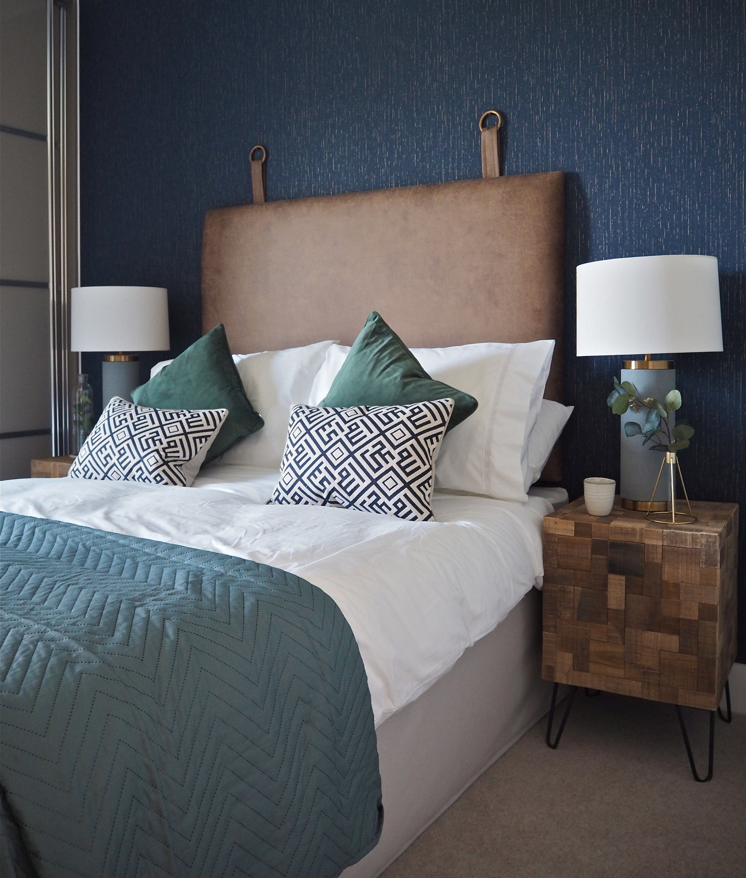
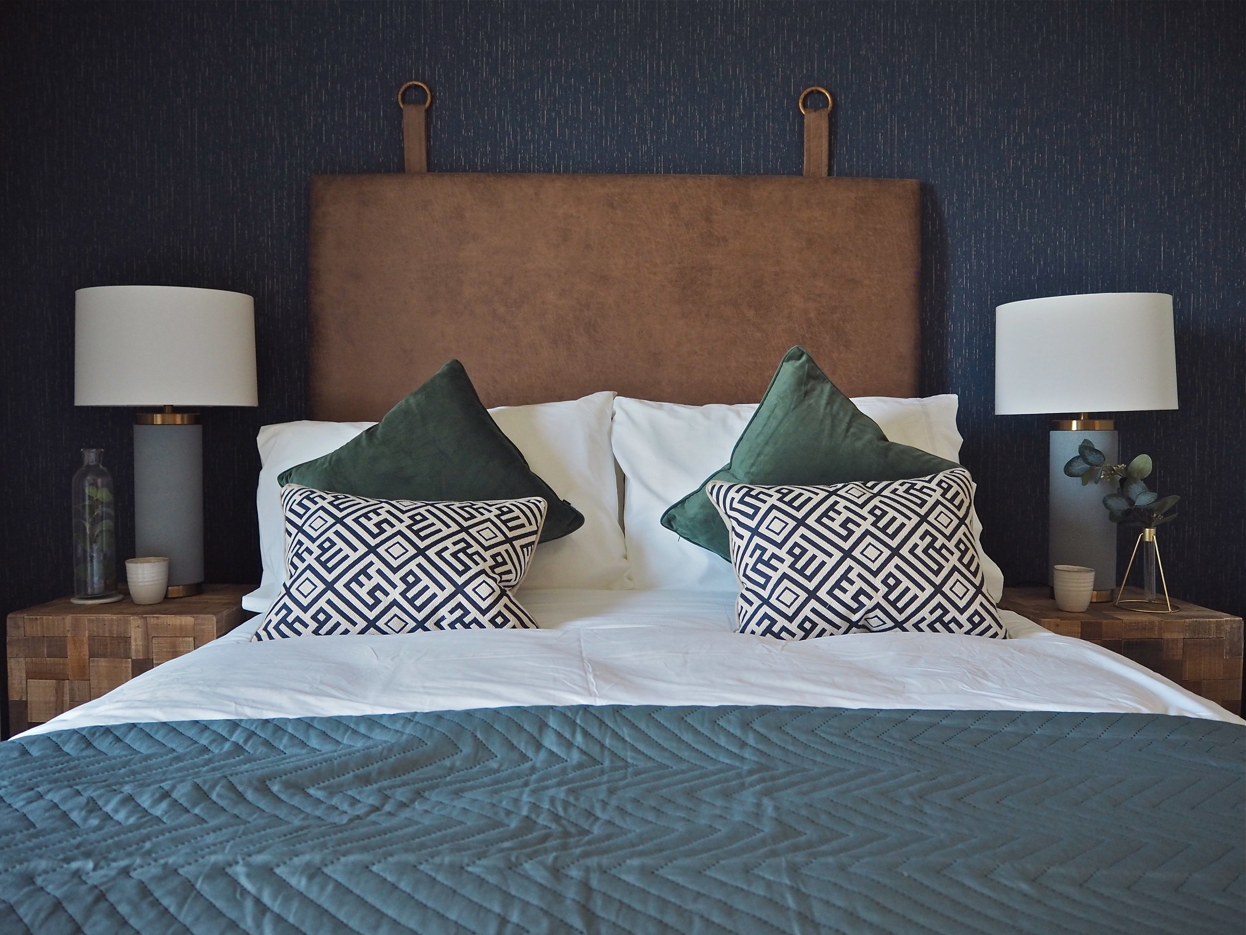
Soft blues are a relaxing shade for a calm, serene bedroom space. It is true that some blues can feel cold, so it is important to choose a blue that has a warm tone and feels rich. Dix Blue and Oval Room Blue by Farrow & Ball are great blues that feel warm and cocooning, rather than cold and off-putting.
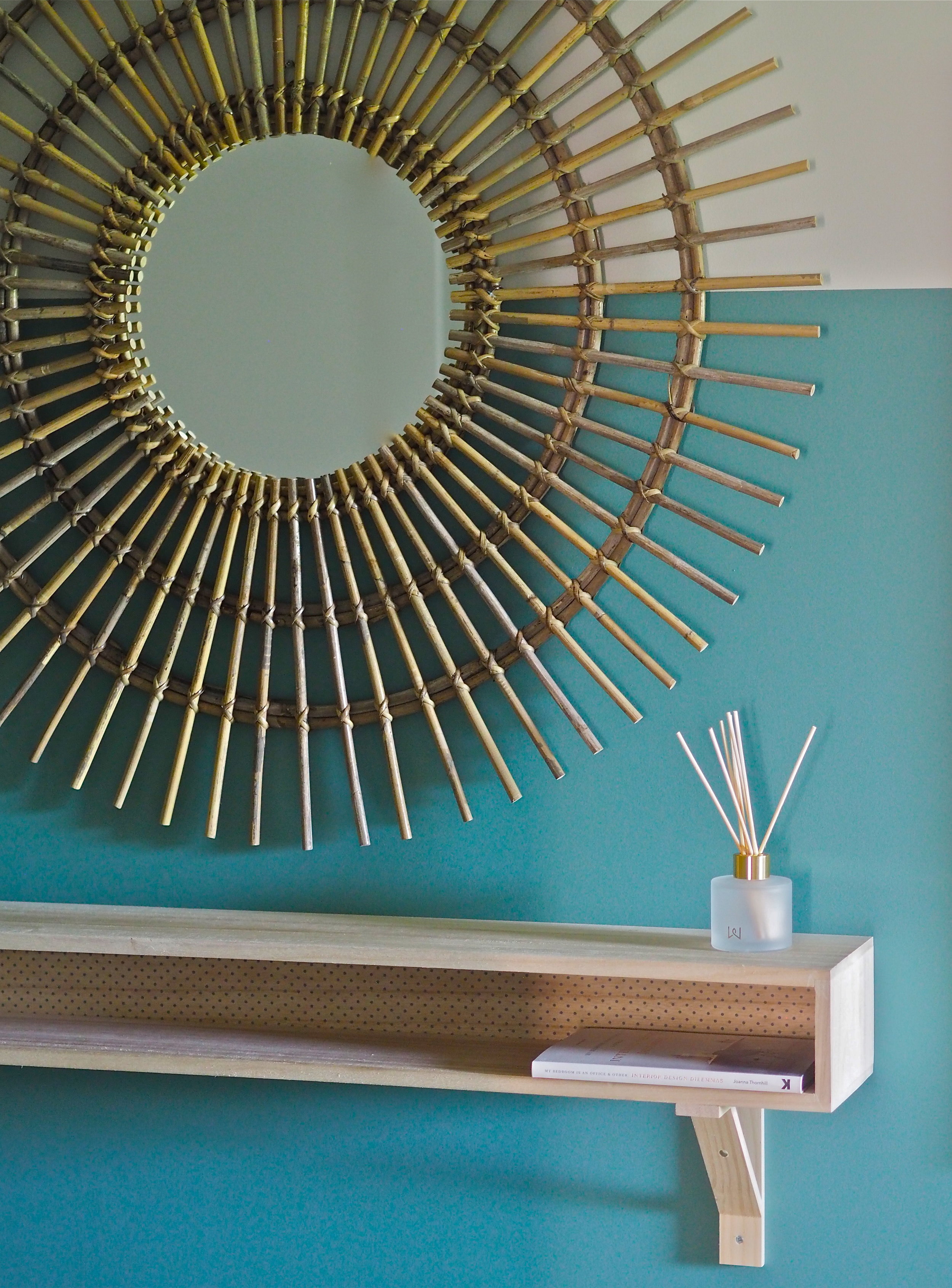
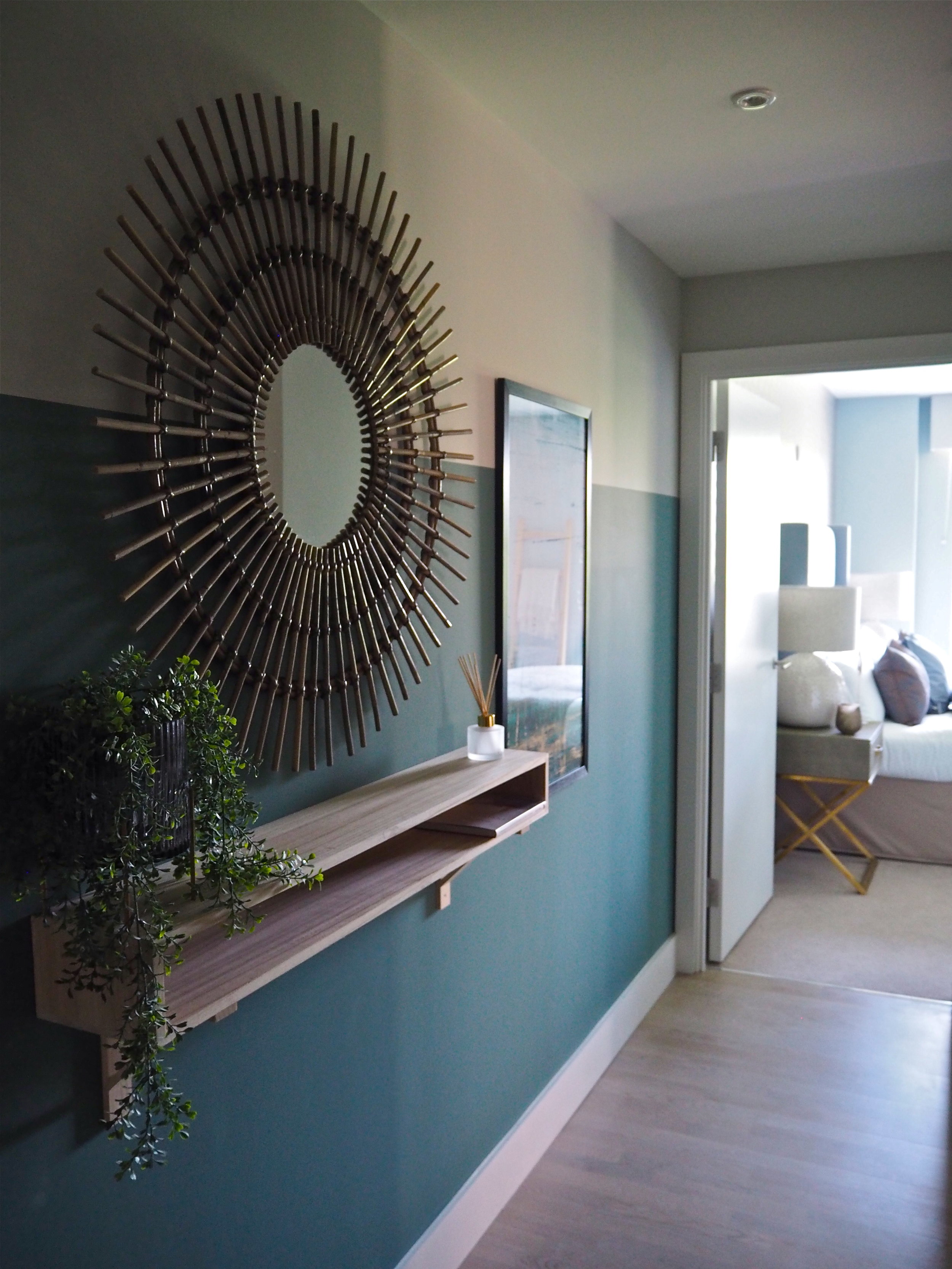
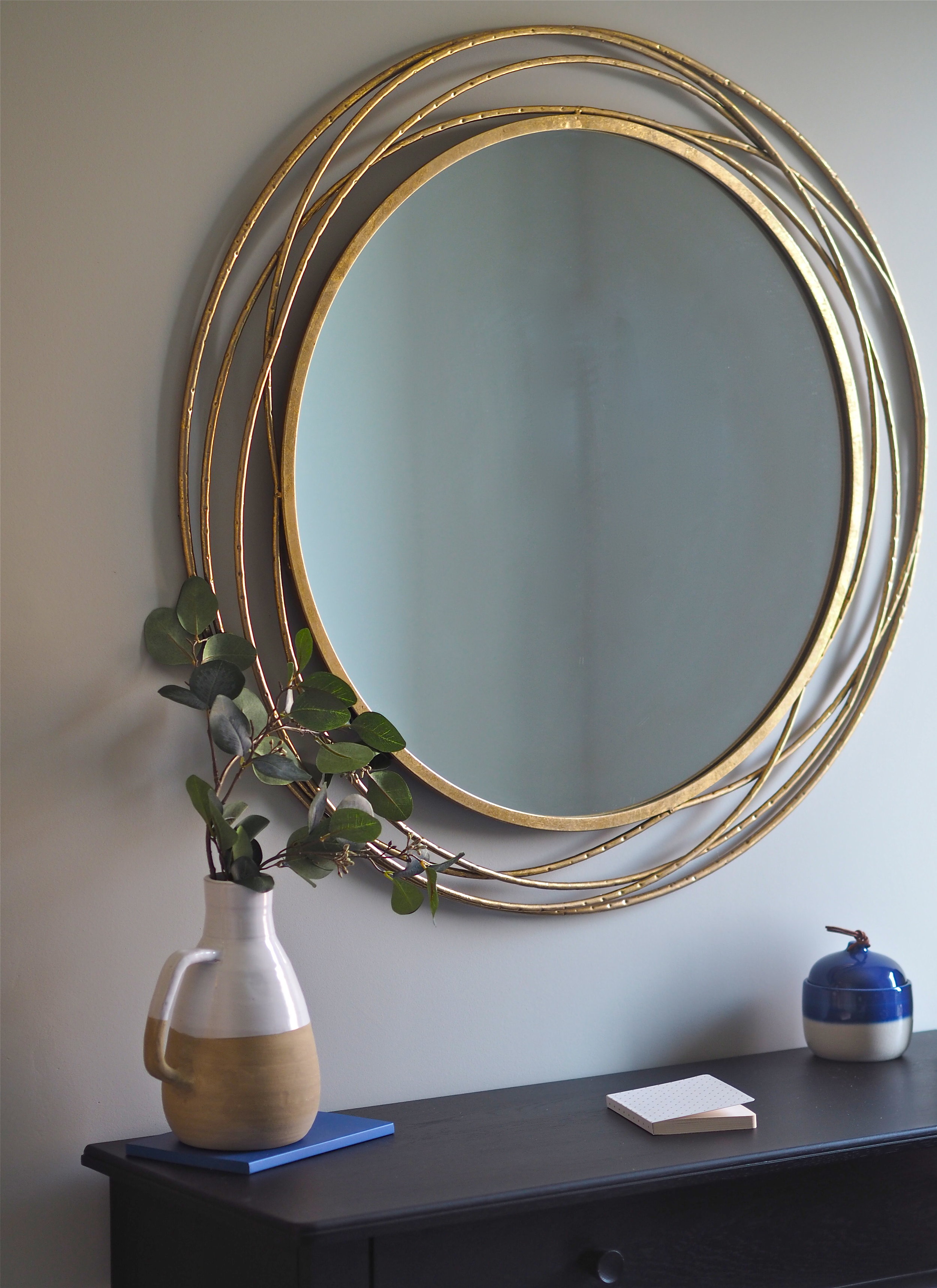
The hallway in a new build apartment can often be the darkest area due to the lack of natural light because of the layout of the building. It is tempting to leave this area painted white, however, I do not feel there is any point trying to brighten up spaces that will never be light, so I am a big fan of painting hallways in dark colours, which in turn make each room off them feel bigger and brighter than they actually are. If this feels like too much of a commitment, a great idea is to create a paint effect like the interior designer has done in the L&Q show home below. They added interest to an otherwise unexciting area by painting the bottom three quarters of the wall in a lovely teal colour. This adds character as it evokes the look of wall panelling often found in period houses, but with a modern, contemporary twist. It also leads the eye directly swooping down to the light in the bedroom it leads onto. A large round mirror provides a great focal point for this space and the shelf, as well as functional, provides a place to add decorative elements. The large amount of storage available within each home in Ropemakers Yard means that there is no need for unsightly coat hooks or shoe storage in this area.
Pattern is an excellent way to add interest within a room. Use bold, vivid patterns on smaller items such as cushions and throws to create a focal point; while smaller, more subtle patterns are better on wallpaper or when covering larger surface areas.
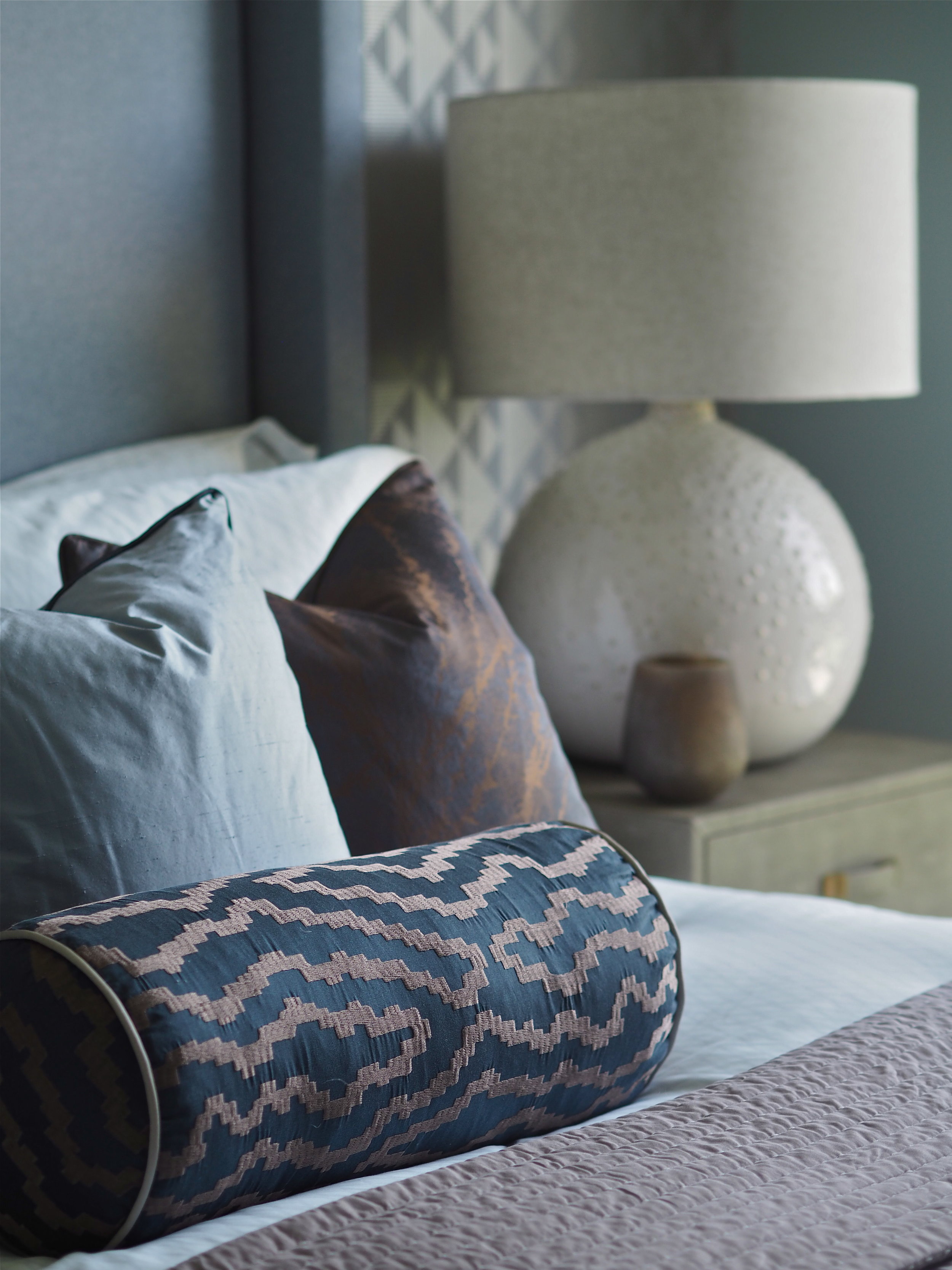
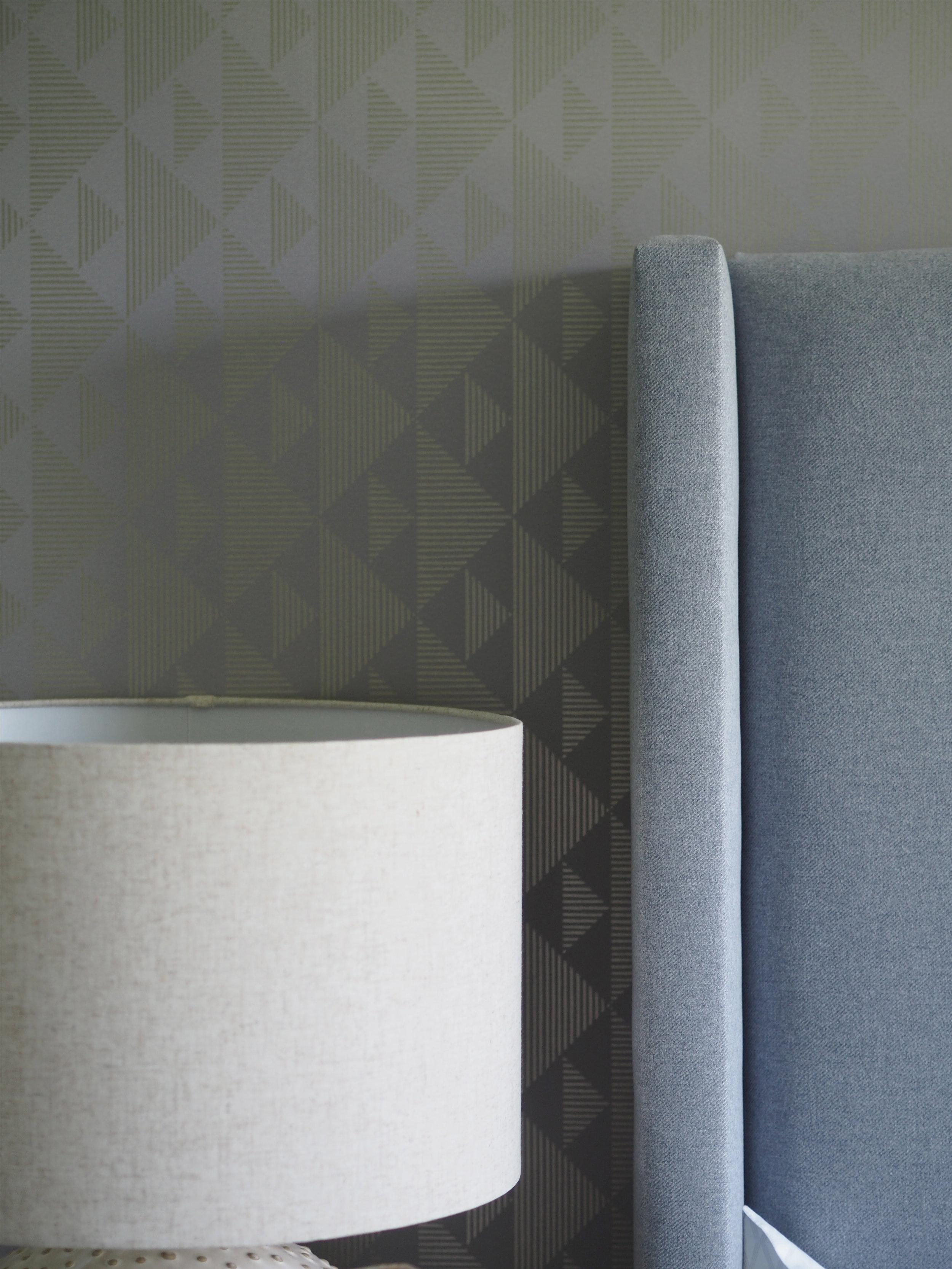
In the L&Q show home, the interior designer has added bold prints to bed bolster cushions, so when you enter the room your eye is instantly drawn to the central area of the space. More subtle patterns are then displayed on the feature wall wallpapers behind the headboard. Again, these then draw the eye to the key focal point of the room - the head of the bed.
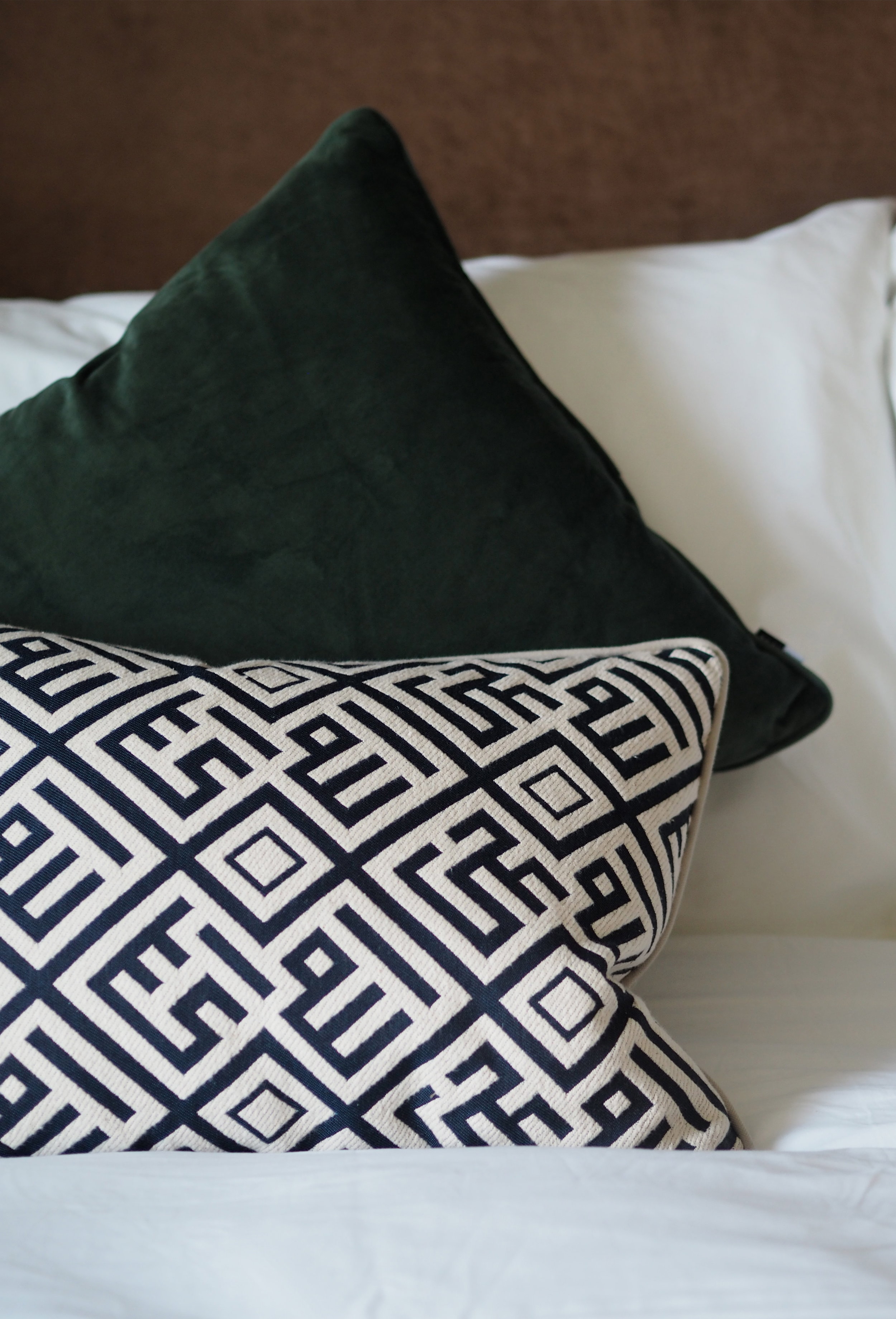
Do not be afraid to build up on pattern in a room, just make sure that there is more subtle pattern than bold. As well as pattern in the soft furnishings and on the wallpaper, the interior team built up pattern in the L&Q show home by using engraved wooden furniture, a subtle criss-cross pattern on the white bedsheets, plus the use of pattern and patina on the dining table. This delicate use of pattern adds to the level of interest in the room without commanding all the attention.
Texture brings depth to your decor, which is vital in terms of layering the elements and creating a warm, inviting home that you want to spend time in. The easiest way to bring in texture is by using different fabrics on your sofa and chairs, rugs, cushions and throws. To go that extra length, bring in accessories made from stone, wood and other material likes clay and leather. If like me you prefer not to use real animal products, then there are some fantastic faux-leather and faux-fur products now available.
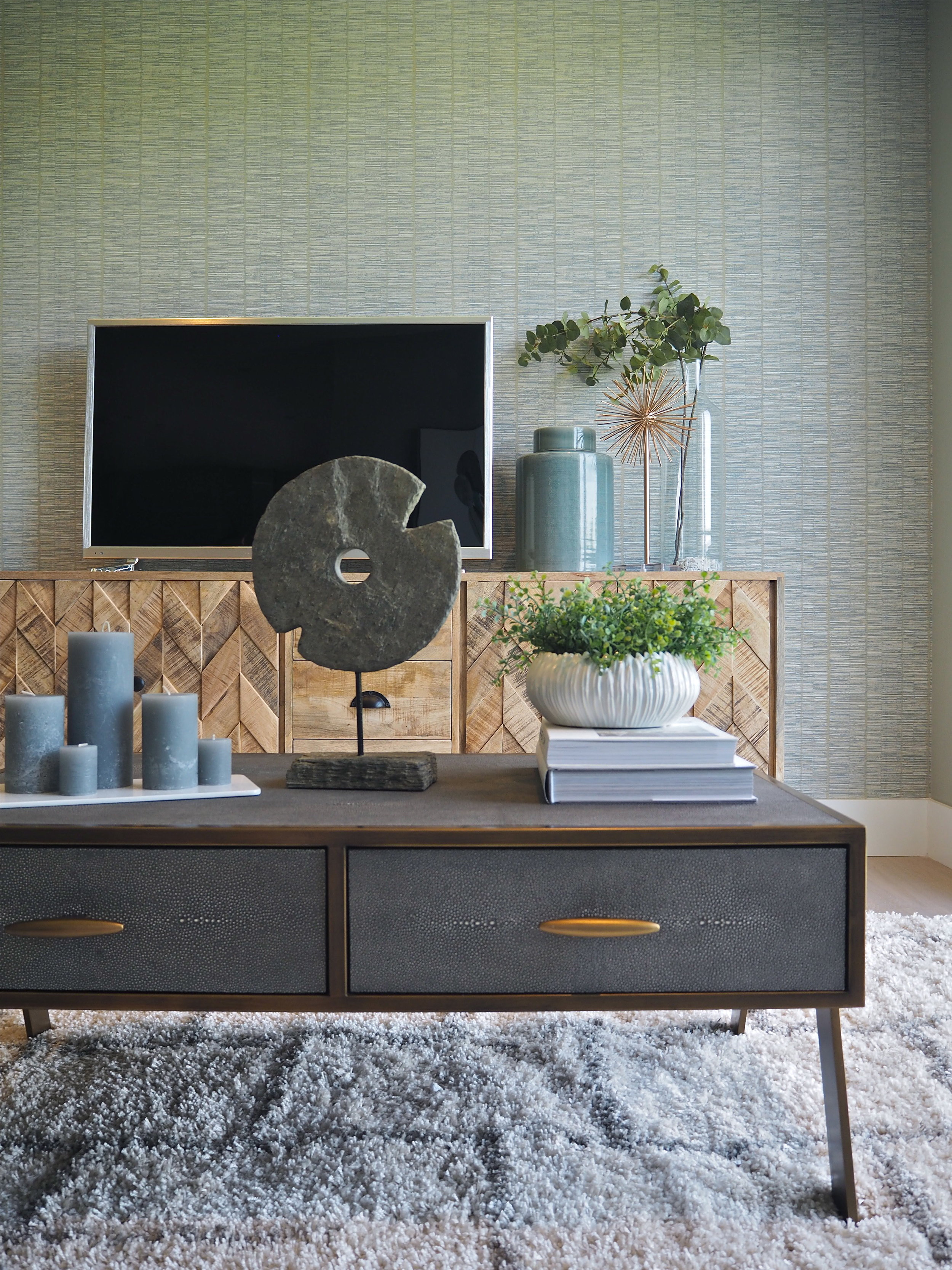
This coffee table adds depth and interest by having a faux crocodile skin texture to it. On top of it the circular stone ornament contrasts with the coffee table. This connection to the natural environment and landscape creates the warm and inviting feel our homes need, while keeping the look elegant and timeless.
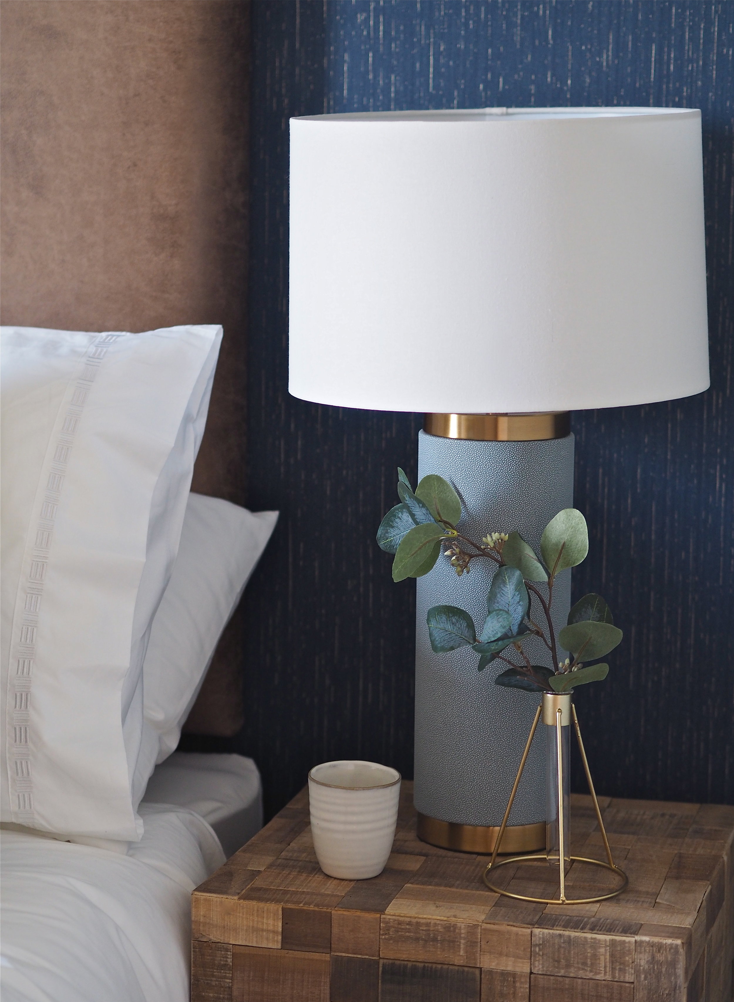
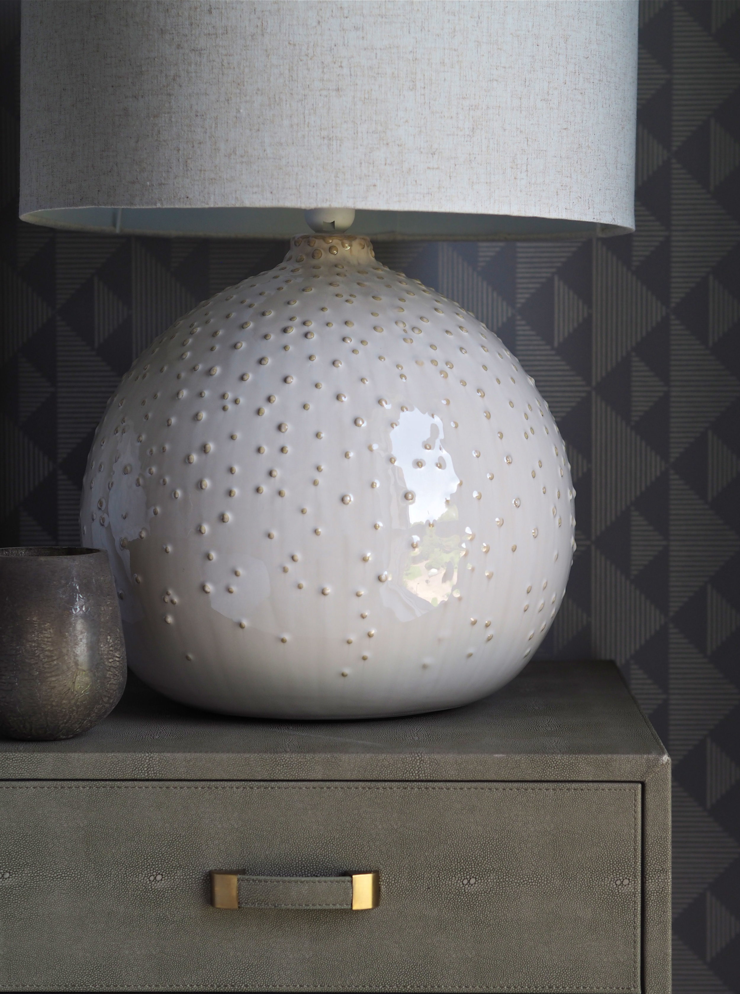
Try and add texture wherever you can. Velvet sofas are really on-trend and add great texture due to the way the fabric can be smoothed in different directions. Fabric headboards are a great way to add extra texture in the bedroom and create that luxurious, hotel feel we all want to capture at home. This lamp base above makes you want to reach out and touch it, so alluring is its texture.
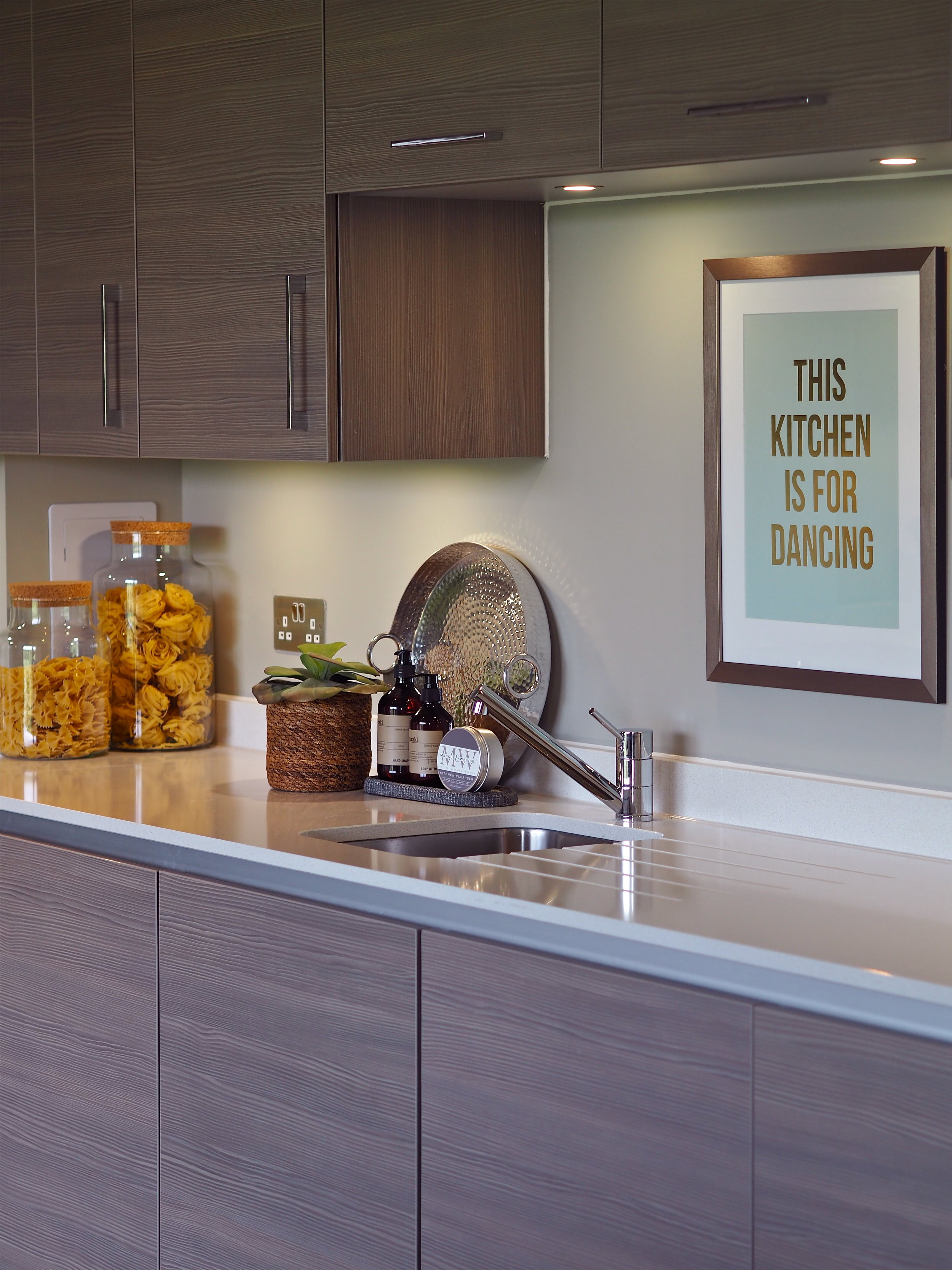
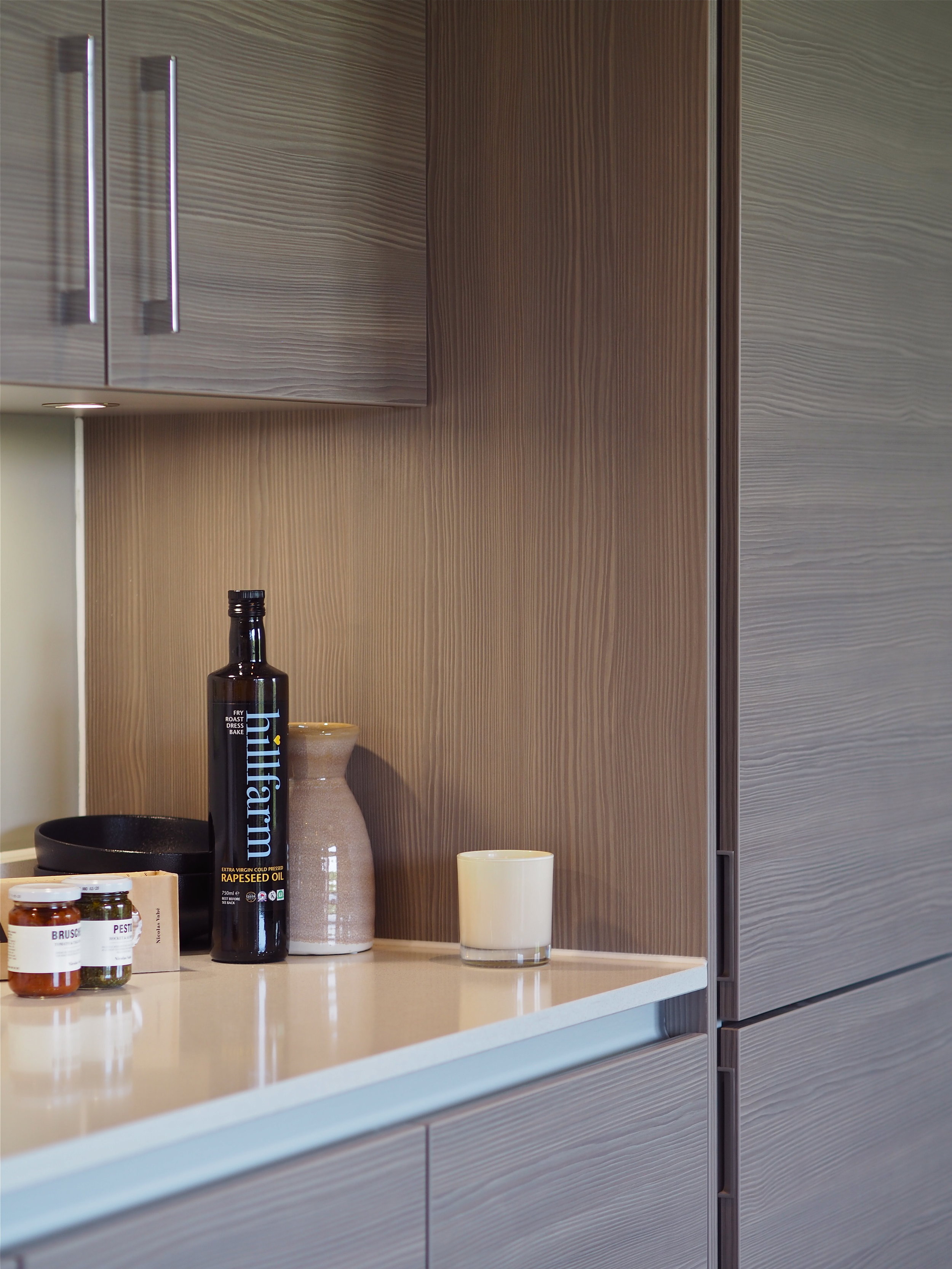
Texture can be found on these wood-effect kitchen doors installed by L&Q in Ropemakers Yard. The grain makes the kitchen feel warm, welcoming and is pleasing to the eye.
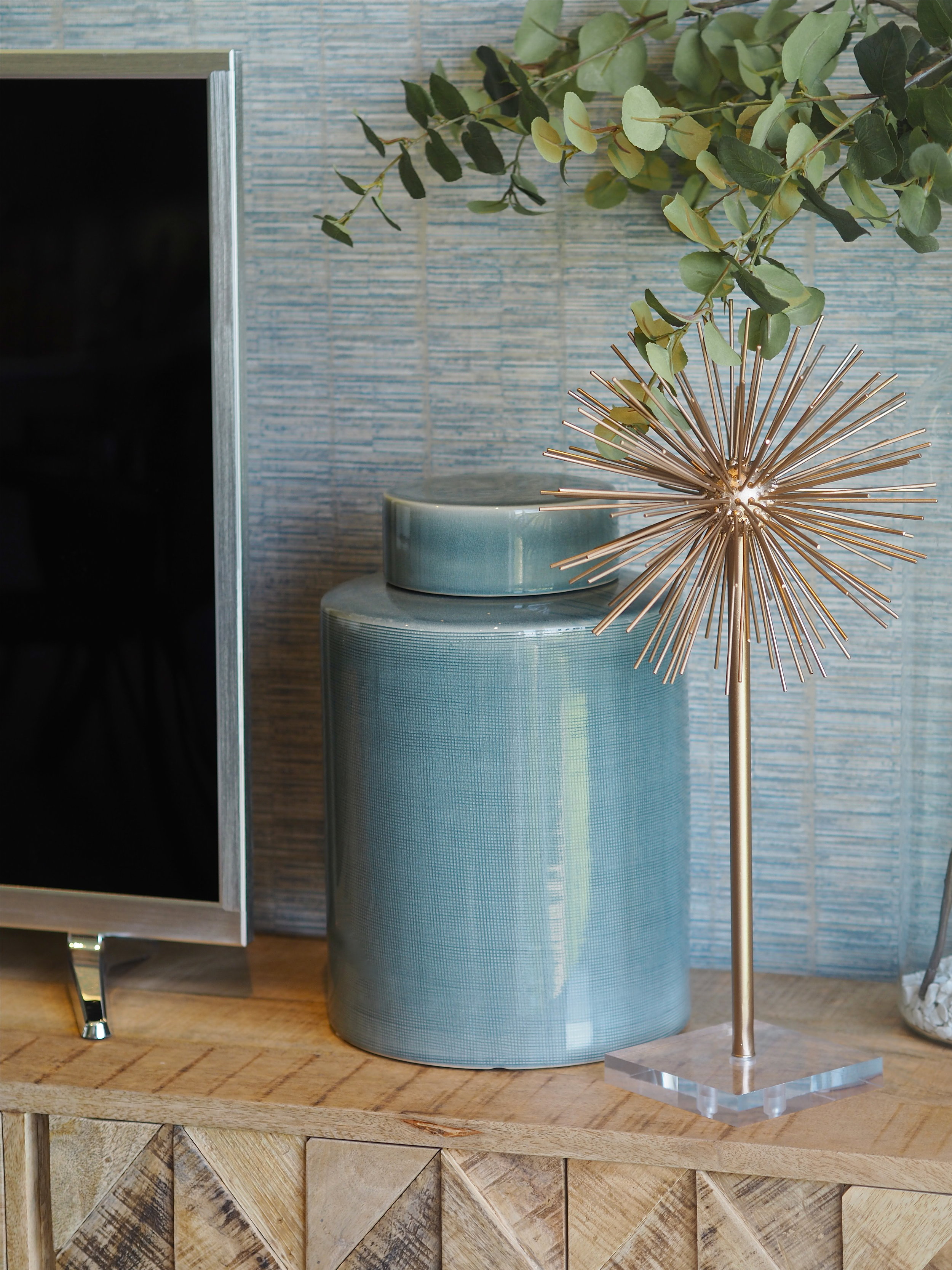
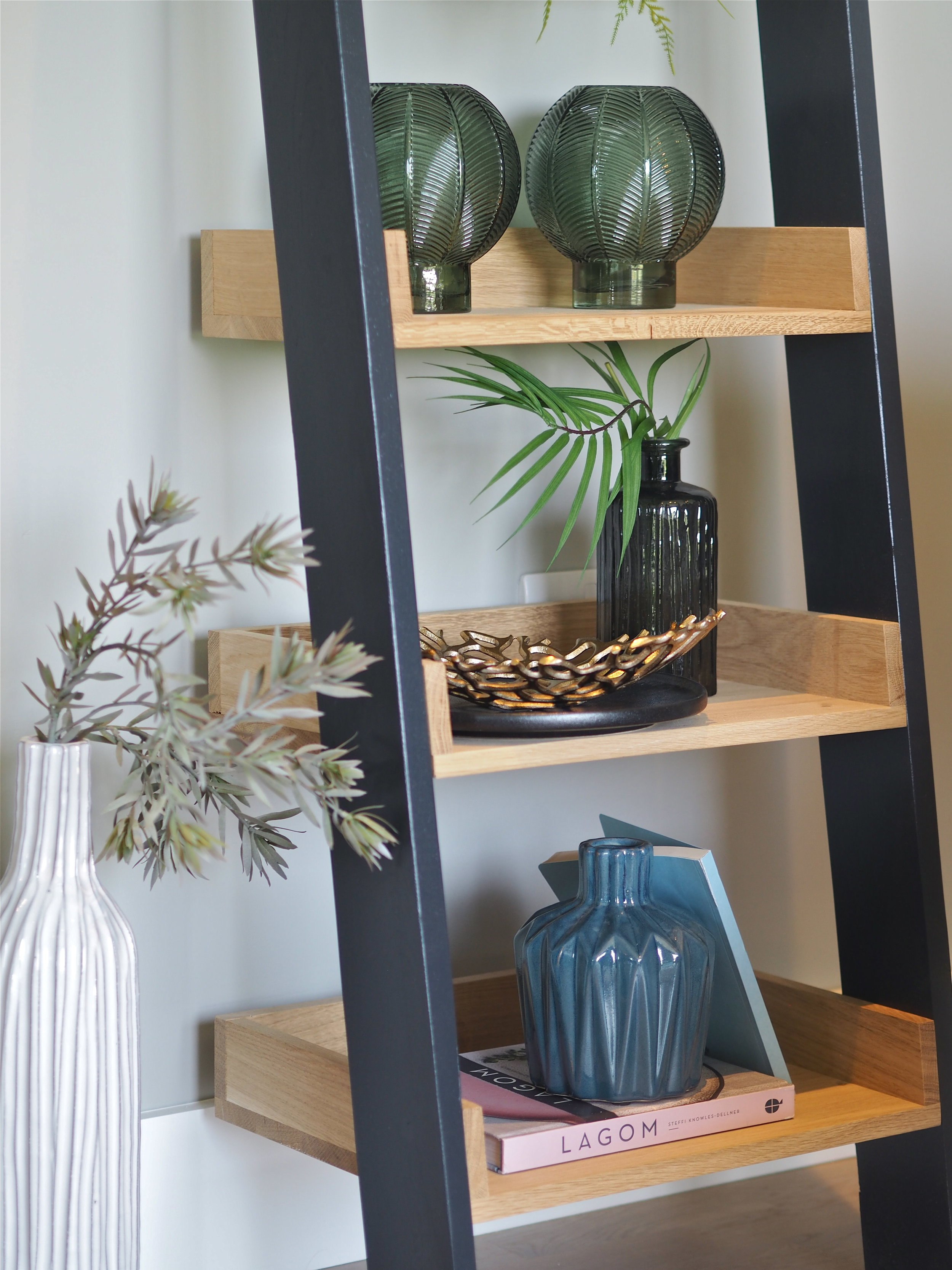
When it comes to the ‘finishing touches’, layering is key. A large collection of home accessories varied in scale and proportion are vital to styling a home and making it feel lived-in and loved. Books, plants, decorative objects, lamps, vases and candles are all essentials that you should invest in. Use shelves, tables and units to strategically place items in a decorative way. Use books to add height to small objects. Add taller items to the end of sideboards and smaller items towards the middle. Think about how you want your home to look - symmetry with decorative items looks more formal, while the placement of single items looks more casual.
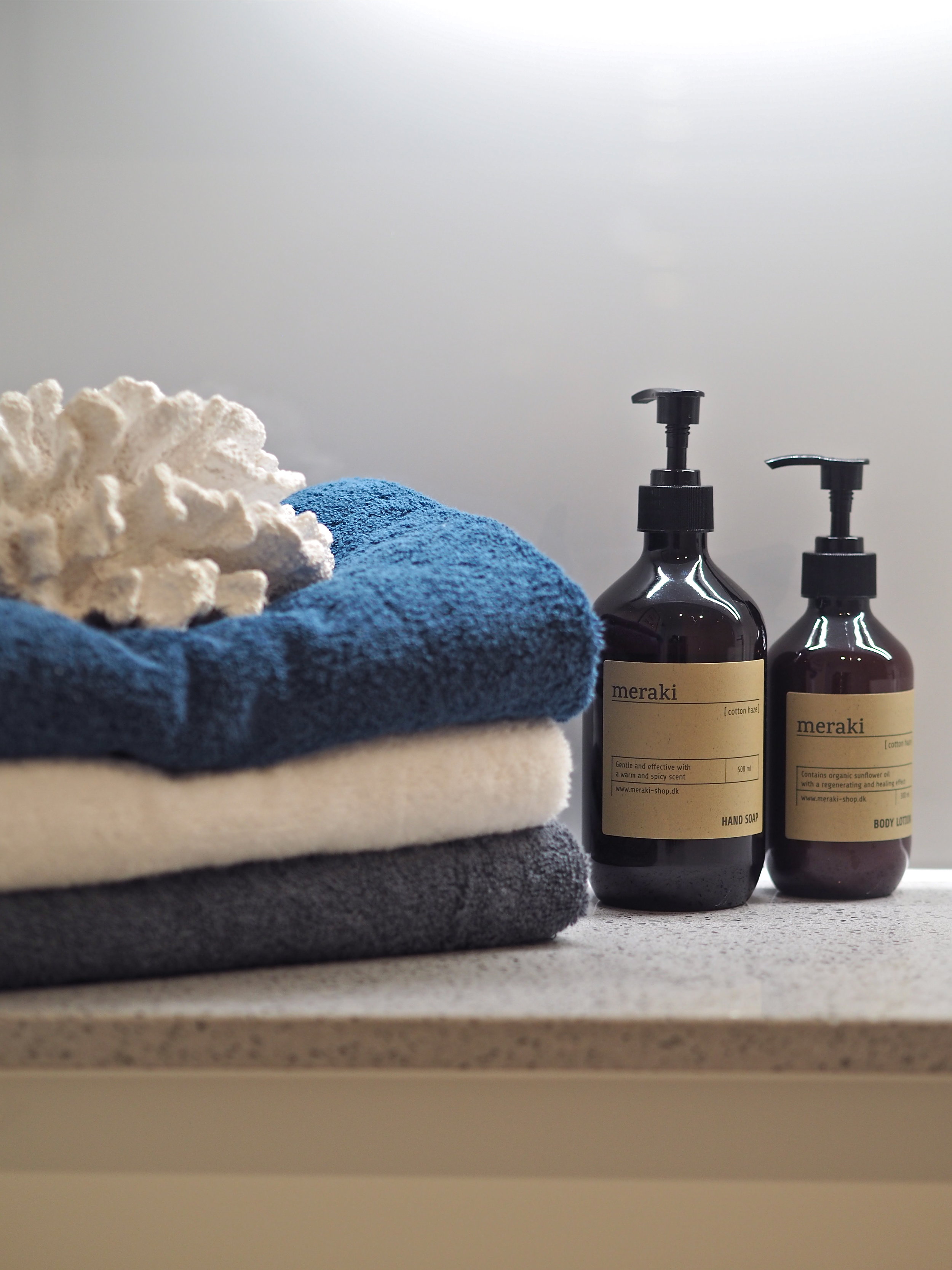
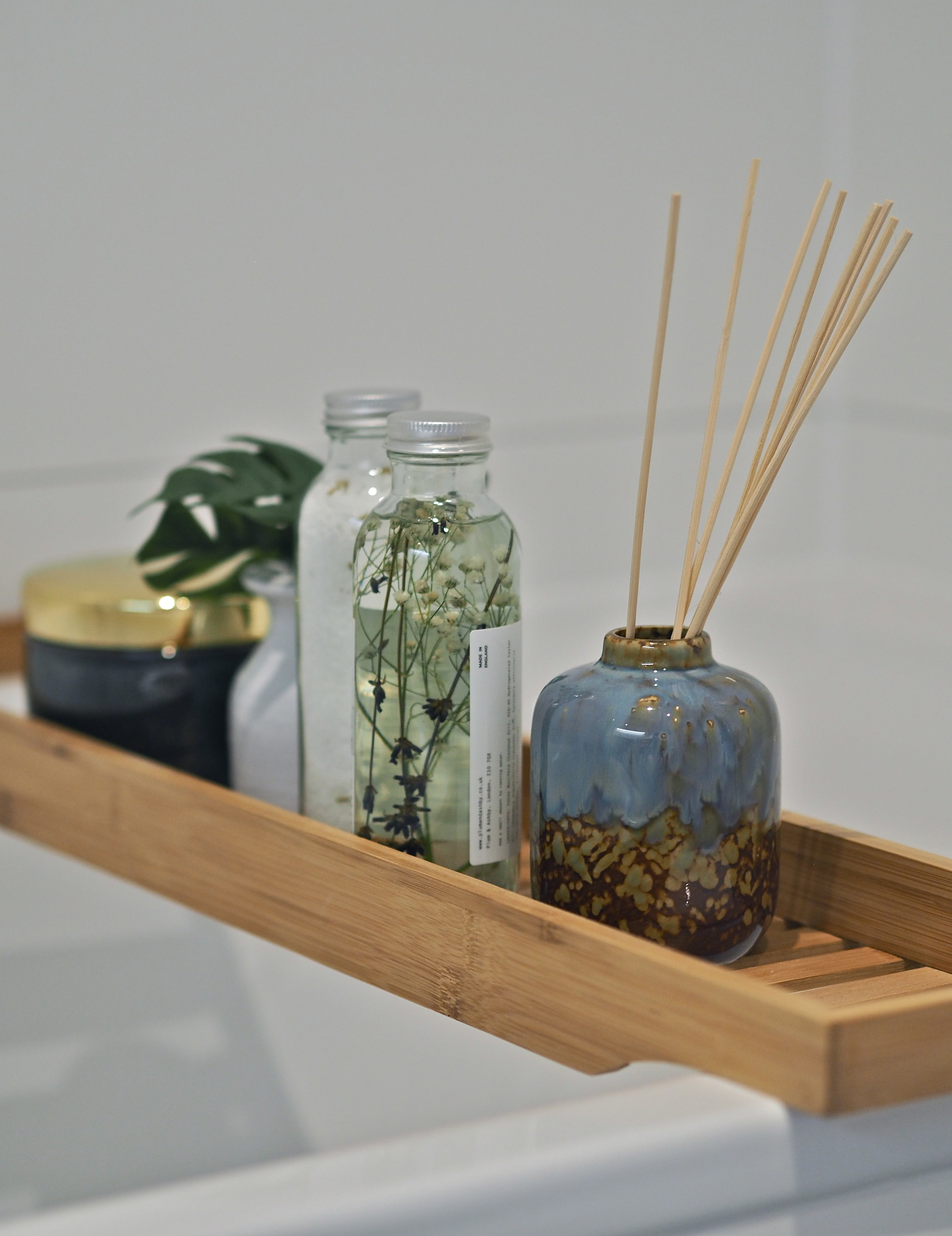
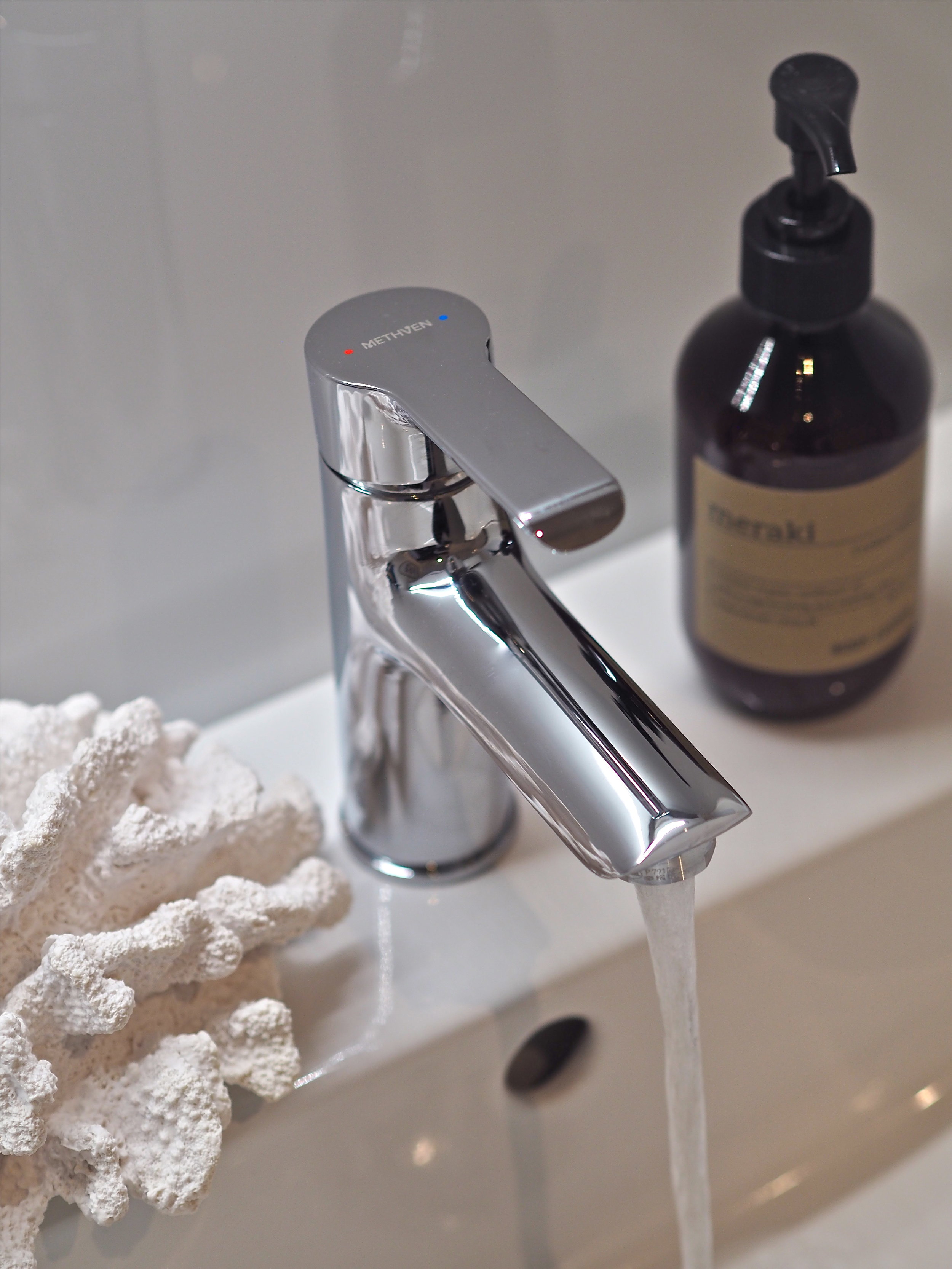
Decorative items should be added to all areas of the home, not just the living spaces. Bathroom products should be kept in attractive bottles and a bath board is a great way to have pretty items on show. In the bathroom, make sure decorative items have a connection to the space. Candles and oils evoke that feeling of spa-like luxury, while the piece of coral used here by the interior designer has a connection to water, which translates in a bathroom and does not look out of place.
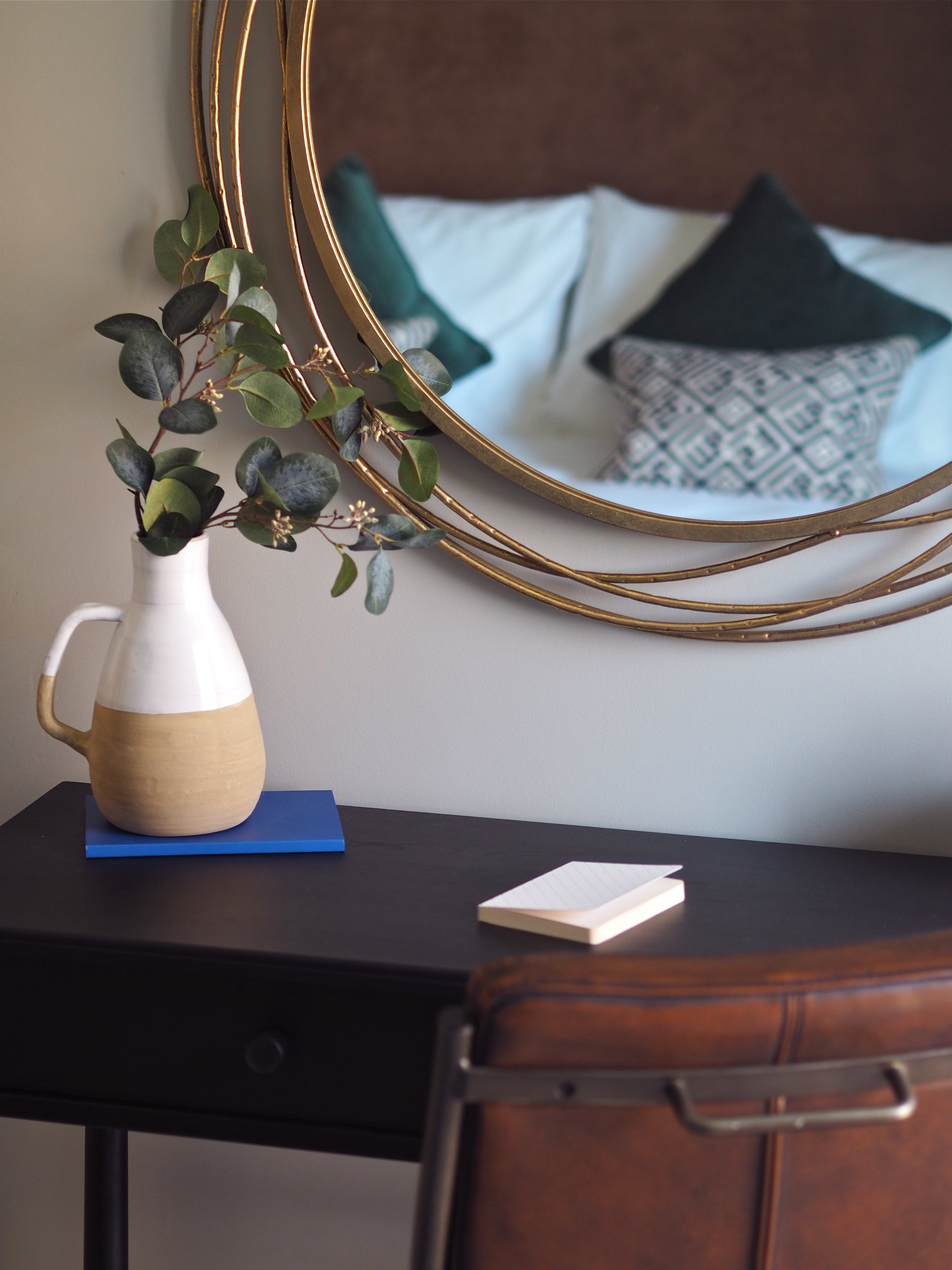
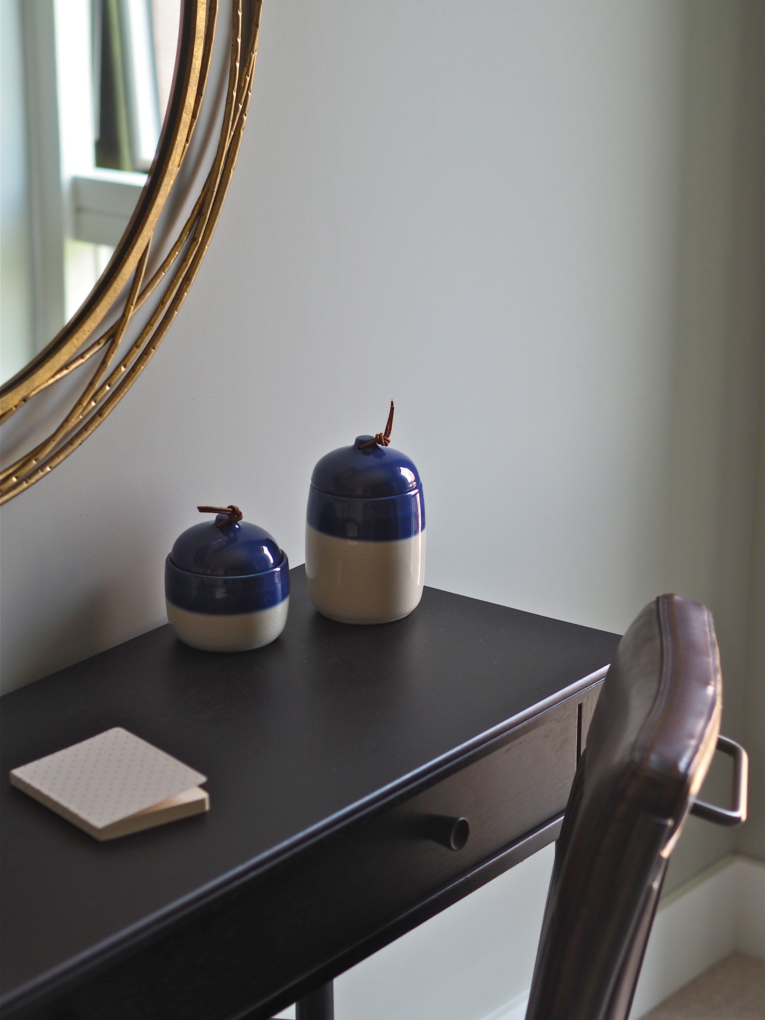
A clever trick if you live in an apartment rather than a large house is to use what is nicknamed ‘skinny furniture’. Skinny furniture has thin legs and may be see-through or lets through light so that it does not feel bulky or like it is taking up too much space. In one of the bedrooms of the L&Q showroom a slim console table doubles up as a dressing table and a desk. A thin-backed leather chair accompanies it. While on the L&Q ‘winter garden’ (called so as there are sliding glass panels that can be pulled out in winter months, making the balcony usable all year round) an on-trend cane chair does not block out any light with its stick legs and see-though weaving.
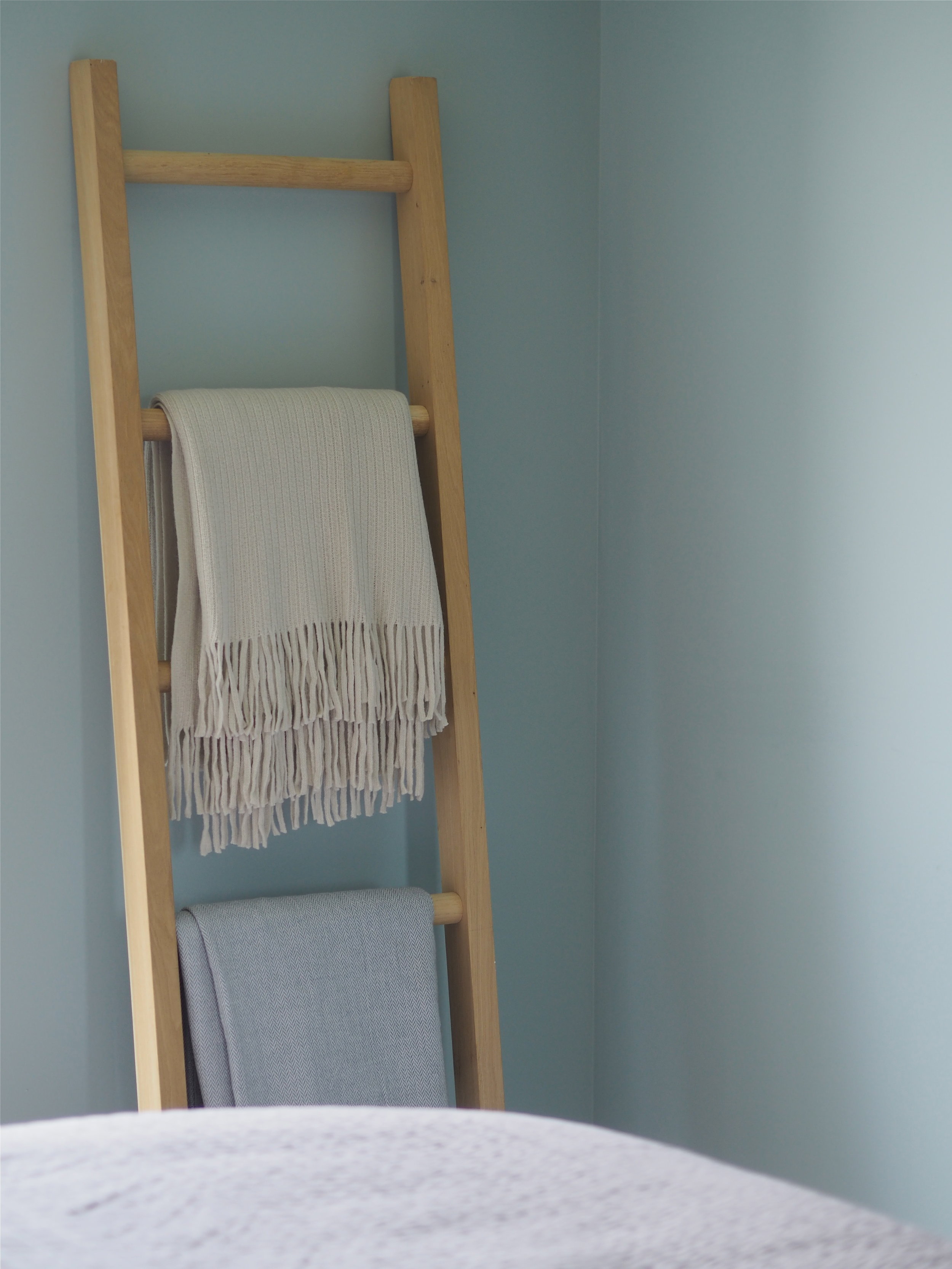
Garden Sofa - Maisons Du Monde / 2. Wallpaper - Jane Clayton / 3. Fabric - Jane Clayton / 4. Poster - Desenio / 5. Coral Figure - Maisons Du Monde / 6. Sofa - Debenhams / 7. Mirror - Melody Maison / 8. Meraki Handwash / 9. Shelf ladder - Habitat / 10. Book - Kinfolk Table / 11. Marble decorative accessory - West Elm / 12. Bamboo Mirror - John Lewis / 13. Sputnik decoration - West Elm / 14. Leather dining chair - West Elm / 15. Sideboard - Swoon Editions
About L&Q:
L&Q house around 250,000 people in 92,000 homes, primarily across London and the South East. As a not-for-profit organisation, they reinvest all the money they make into new and existing homes, creating sustainable communities and providing excellent services.
